We were approached by an expert in the health and fitness space with the initial idea for the most nutrition-dense greens powder on the market. V80, as it is now called, is a supplement powder that contains 80 active vitamins, minerals, supplements and superfoods. So the product side of the business was there, but the infrastructure for it to succeed needed building.
Read on to learn how we lit the initial spark that fueled the growth of industry leading supplement brand, Verve
As part of our design sprint process we spoke to a number of people who were actively involved as consumers in the health and fitness market, and conducted our own research on competitors from, what was largely, an outsider’s perspective. From this we found that the greens powder market was crowded with high priced, low quality, and confusing products. In fact, it was already saturated with similar looking brands with similar messaging and products to V80.
The major challenge we were then faced with was, how would we effectively explain to customers the ways in which the V80 product was superior, how it simplified the entire process, and how would we create a brand that would connect with people who want to take their health more seriously.
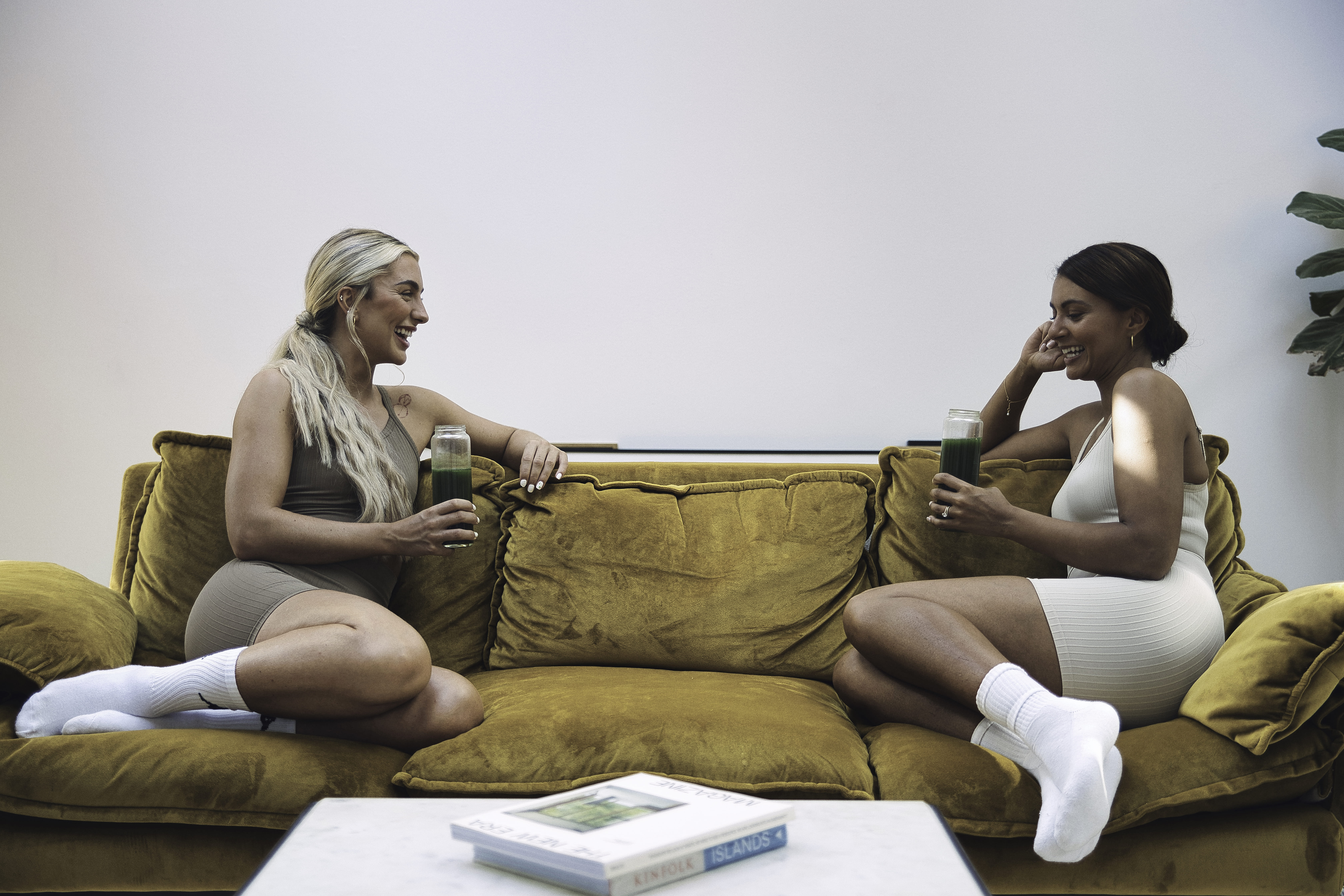
In addition to this, there were some more minor considerations that we would need to make too. For example, we identified Athletic greens, Rheal, and HUX as three major competitors, and, from our audience testing, it was clear that some brands were marketing far more towards one gender than the other, and this divide was something we leaned into. However, whilst we believed there was an opportunity to target both men and women, we equally knew we needed to avoid creating a brand that’s too neutral and that neither men nor women would choose over the brand’s competitors.
So, visually portraying the brand’s intended positioning statements through the brand name, branding and packaging, and tone of voice was the more overarching challenge for us. Furthermore we would have to do so, whilst building the brand entirely from the ground up, translating the core idea for a product into a website that stood out in an extremely crowded market.
Before we could get truly stuck into the branding, website development and everything else that would ensue, the brand needed a name. We went through a ton of options, exploring how each potential name weighed up against competitors, how it would potentially work in a url structure, and how branding and taglines would work. Our test audience believed that Verve sounded immediately like a nutrition brand, and it naturally lended itself more to brand USPs and taglines, such as VavaVerve, which we would use as a hero tagline.
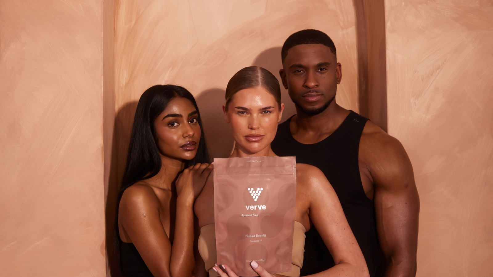
From a visual perspective, the colours and imagery needed deciding on first. When looking at competitors we found that, again reinforcing the large gendered marketing disparity, brands were either leaning heavily on dark colours contrasted against bright splashes of neon colours such as blue or red when marketing primarily to men, or choosing pastel colours such as yellow and pink when marketing primarily to women. For Verve, there needed to be a primary and secondary colour palette, one for their website, and one for their product packaging.
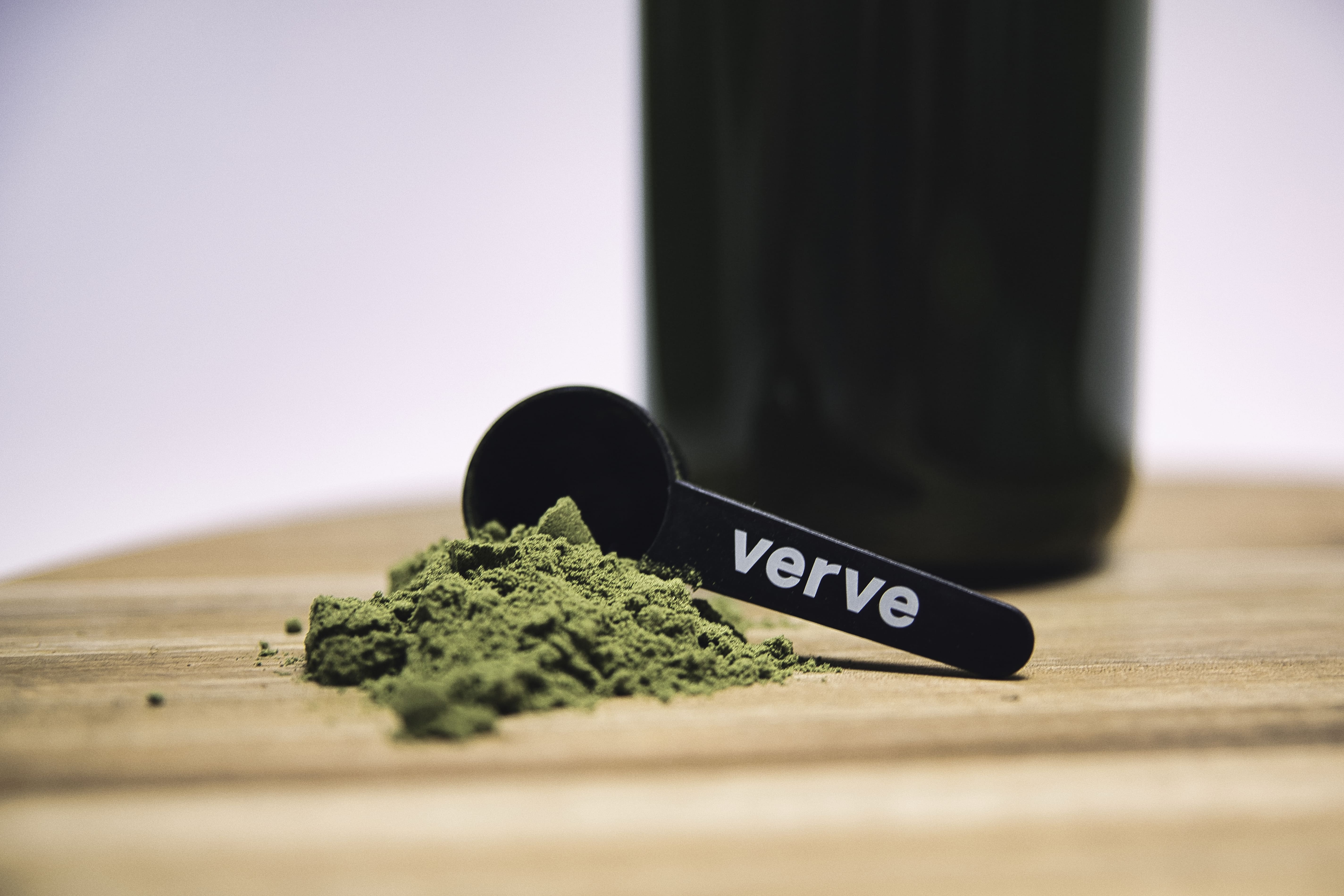
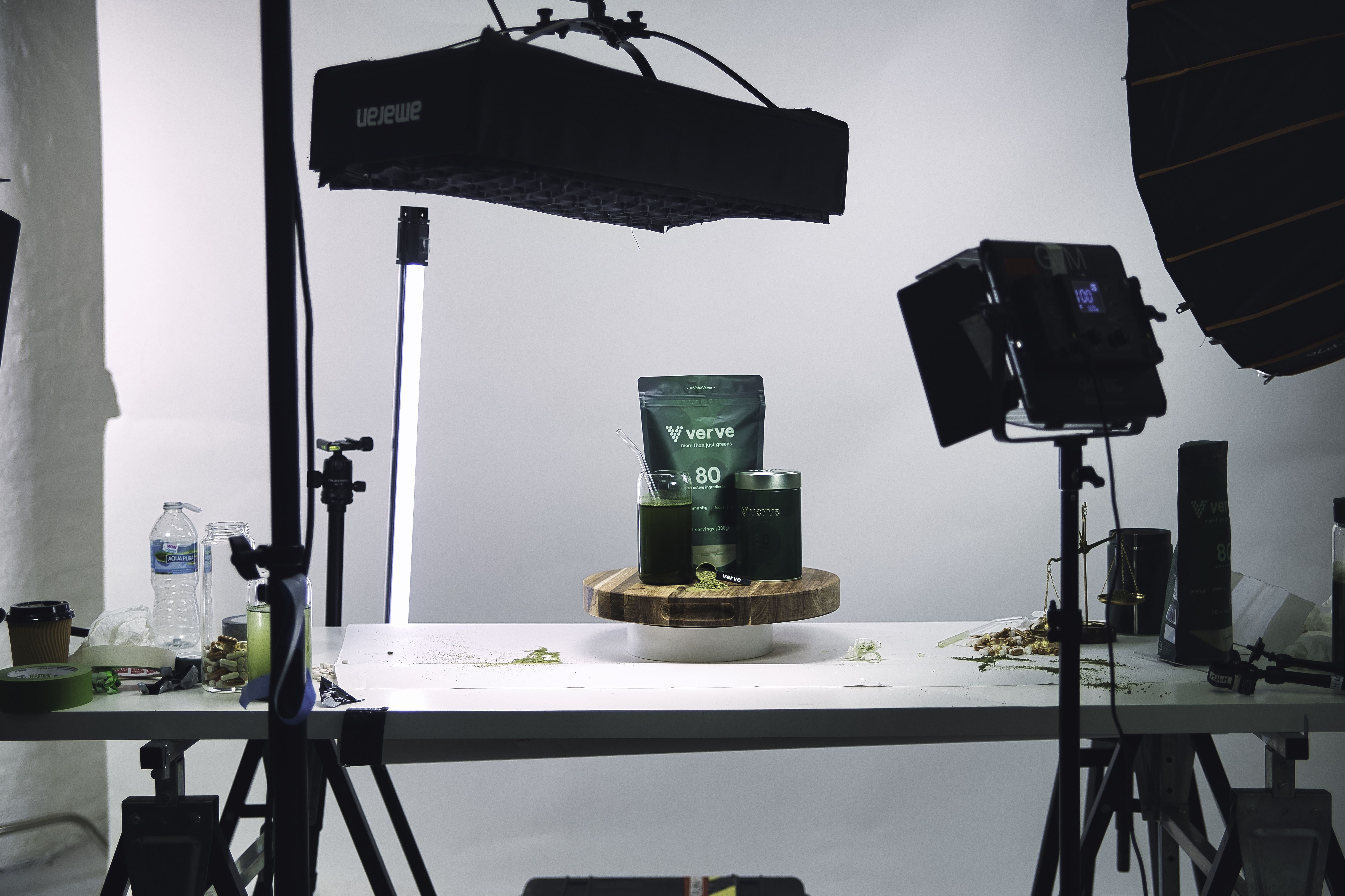
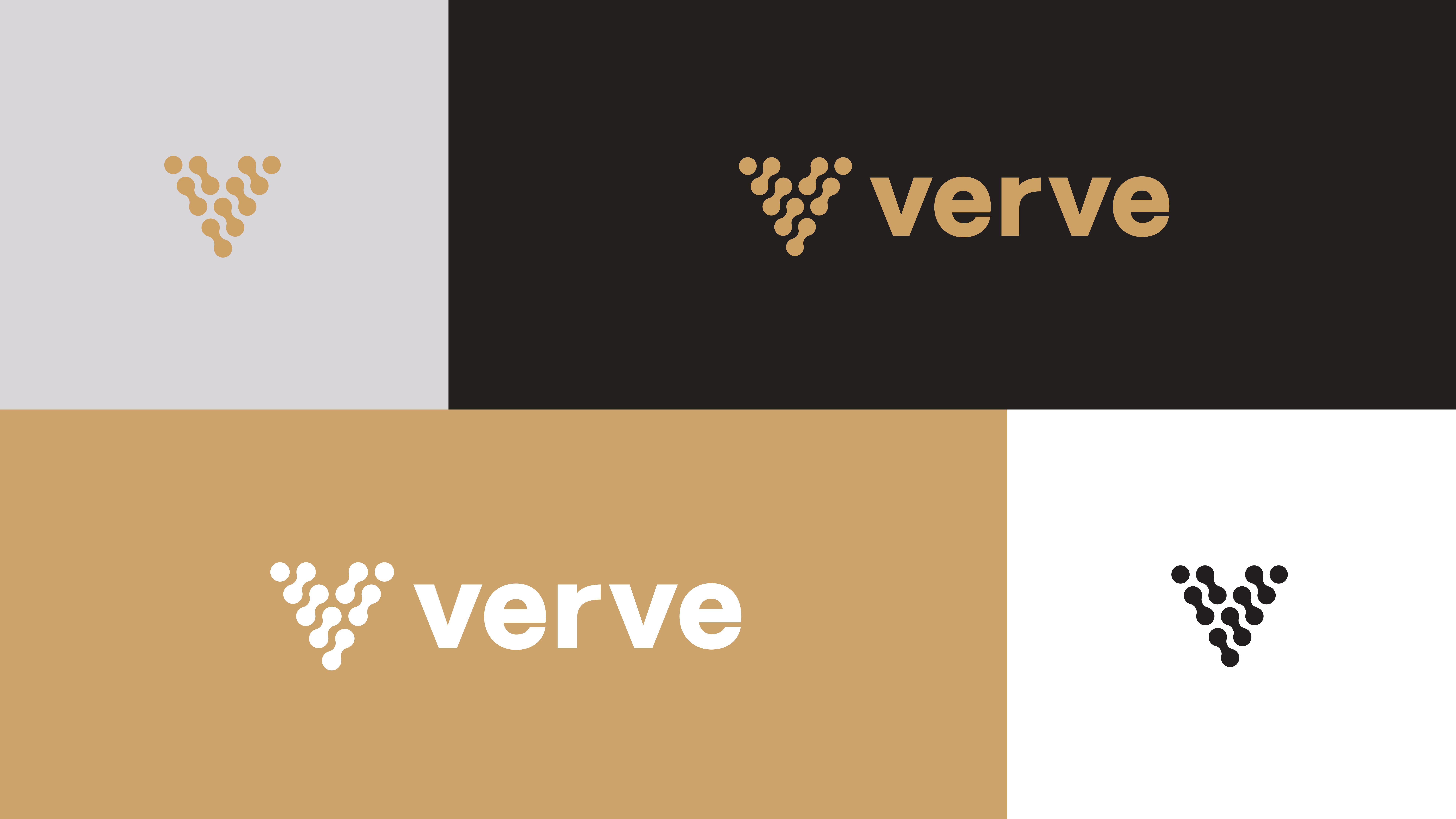
We eventually decided on a primary colour palette built on black, white, grey, and bronze for the website; very neutral colours. And then three different shades of green for product packaging, emphasising one of the primary taglines - all your greens and nothing to hide.
You could argue we presented too many logos, but this really is the process that it takes in order to find the best logo available.
We actually used this spherical, 12-pointed star for a majority of our mock-ups, it wasn’t until the “scientific V” logo, as it was known internally, was created that we had a new front runner. This logo beat out three other logos in the final stage of decisions to be the final, in-use logo. Everyone involved decided that the “scientific V” logo represented the brand’s values the most and could be used most in the most versatile fashion.
We knew in order for this product proposition to be a success, and for people to implement it into their lifestyle routine, it required a subscription model as the primary way to purchase the product. Furthermore, the introduction of a subscription model could be emphasised as one of the brand’s major positioning statements, which is where the tagline “More than just greens: Your new daily habit” came from.
Finally, it was essential that details around the nutritional value of the 80 ingredients was placed front and centre. This meant that we could be transparent, educate, and wow the consumer, with the brand's major selling point; that V80 is jam packed with far more ingredients than others on the market.
We now had the whole branding framework to support the V80 product, allowing us to get stuck into the marketing and web development side of the business.
Upon the completion of web copy, UI and UX design, a robust CRM system and an SEO build out for the website launch, the Verve brand was officially up and running. The subscription based service was built into Shopify, this section heavily leaned on the brand visuals that championed the list of 80 ingredients and nutritional values that the product delivered through clear iconography and filter functionality.
Since going to launch in October of 2023, Verve has…
Want to learn how we could bring your business idea to life? Contact us, We'd Love to hear from you.
Every great relationship starts with a conversation, so schedule your call with us now and let’s find out how we can help you unleash your potential.
The Slice is our monthly newsletter, delivered straight to your inbox on a monthly basis. Receive the latest in ecommerce news, discover our latest work, insights to help you grow your business, and more.