.gif)
BRANDS FORMED
TOUCHPOINTS DESIGNED
AVERAGE NPS SCORE
We transform ecommerce brands with purposeful design and authentic storytelling. Our creative team brings unmatched expertise to solve your brand's challenges, helping you stand out in a crowded marketplace and build meaningful connections with your audience.
Your brand is your most valuable asset-it's how you inspire trust, grow your community, and make a lasting impact. We combine industry insight, creative excellence, and a human- centred approach to craft brands that resonate and drive growth.
Using our years of industry knowledge and experience, we’ll deliver a rigorous ecommerce business plan that translates into a truly distinctive brand. In the process, building a solid foundation on which to inspire trust, grow your community, and create authentic connections with your customers.
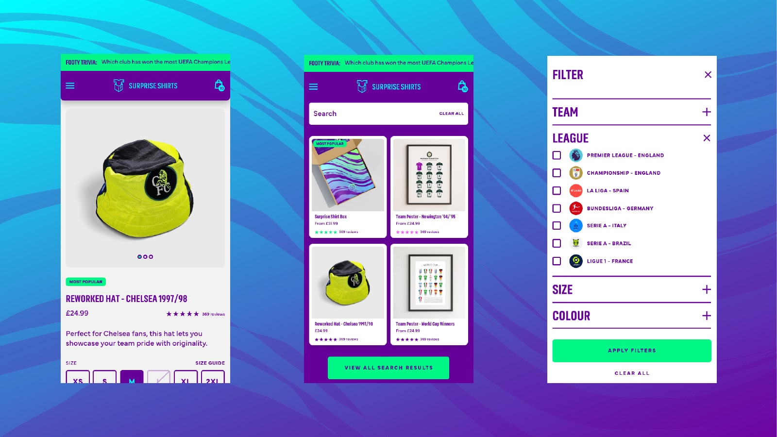
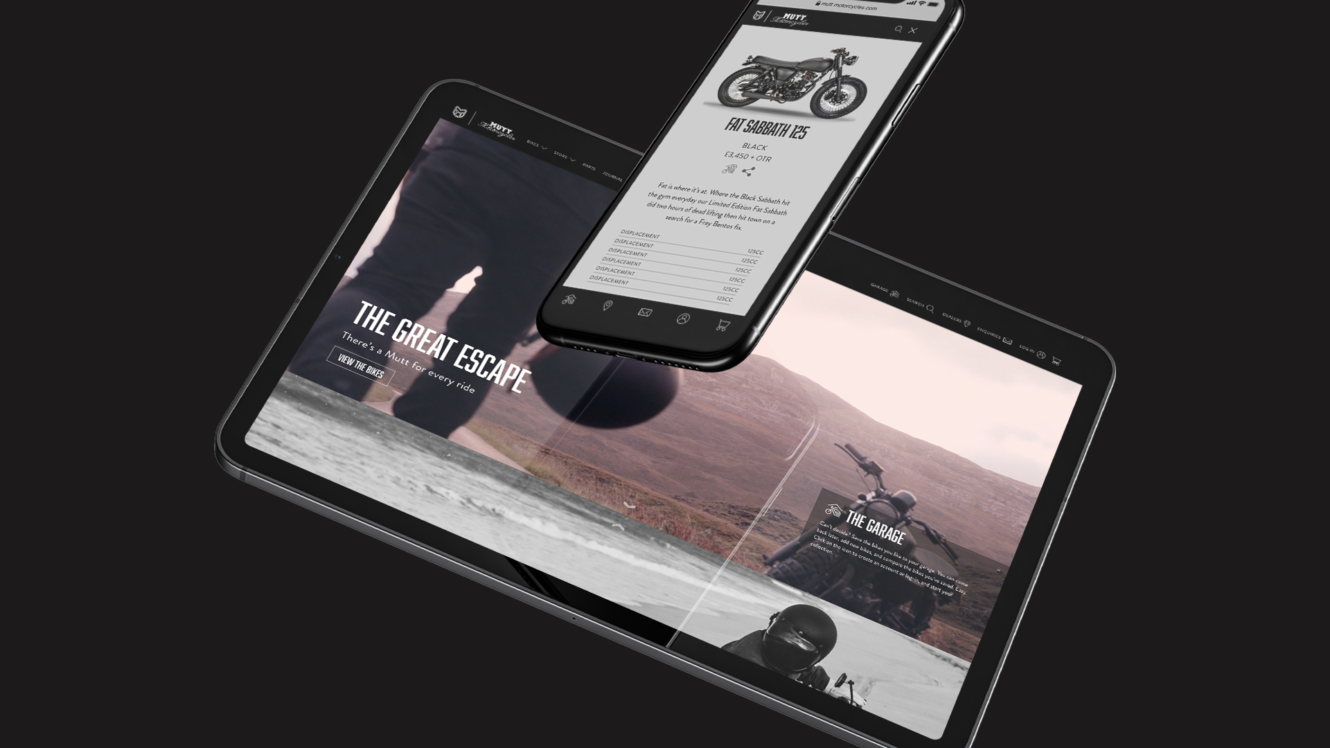


Whether it’s effectively scaling performance marketing spend, building an ecommerce mobile app, or building Shopify Plus sites built for the future - fashion brand P&Co has trusted Cake Agency as their ecommerce partner since 2019.
Service Length
7
+ YEARS
ECOMMERCE CONSULTANCY
SHOPIFY DEVELOPMENT
MOBILE APP
PAID ADVERTISING
.png)
From SEO strategy and paid social media to brand positioning and ecommerce consultancy, Killstar has trusted Cake Agency as their ecommerce partner since 2024.
Service Length
1
+ YEARS
ECOMMERCE CONSULTANCY
PAID ADVERTISING
SHOPIFY DEVELOPMENT
Email marketing, paid social media, and Shopify Plus website development. Founded in the West Midlands just like us, it’s a joy to be LUKE 1977’s trusted ecommerce partner.
Service Length
3
+ YEARS
SHOPIFY DEVELOPMENT
PAID ADVERTISING
ECOMMERCE CONSULTANCY

They’ve traded online for over 20 years, so we’re pleased to be the go-to ecommerce partner for sleepwear retailer Cyberjammies. From Shopify Plus development to performance marketing and Search Engine Optimisation, it’s been a 360° journey from start to finish.
Service Length
5
+ YEARS
SHOPIFY DEVELOPMENT
PAID ADVERTISING
ECOMMERCE CONSULTANCY

Bursting with creativity. From performance marketing to Shopify website development - we’re the trusted ecommerce partner of tattoo-inspired fashion brand High Dive Apparel.
Service Length
3
+ YEARS
SHOPIFY DEVELOPMENT
PAID ADVERTISING

With services spanning UX & UI design to push notification strategy, Cake Agency has been the driving force behind the mobile app of fashion brand Distrubia.
Service Length
2
+ YEARS
MOBILE APP

We’ve been working with rock N’ roll-inspired fashion brand OTHER for multiple years. We’ve built them a new Shopify Plus website, have been leading the charge on performance marketing, and have become their trusted partner in ecommerce along the way.
Service Length
2
+ YEARS
SHOPIFY DEVELOPMENT
PAID ADVERTISING
ECOMMERCE CONSULTANCY

Starting with an ecommerce platform migration and staying with us ever since, we’re proud to be the pioneering ecommerce partner of London-based Bakery Chain, Konditor.
Service Length
3
+ YEARS
SHOPIFY DEVELOPMENT
PAID ADVERTISING

We've gone from building the brand foundations to pushing a loyalty program live, and have loved every minute. We’re proud to be the ecommerce partner for Aran Woollen Mills - and have been since they established their consumer business in 2021.
Service Length
4
+ YEARS
ECOMMERCE CONSULTANCY
SHOPIFY DEVELOPMENT
PAID ADVERTISING

Green Sheep Group are a designer of innovative, award-winning sleep accessories for newborns and parents. We’ve been their go-to ecommerce partner and have developed multiple custom-built Shopify Plus websites.
Service Length
3
+ YEARS
SHOPIFY DEVELOPMENT
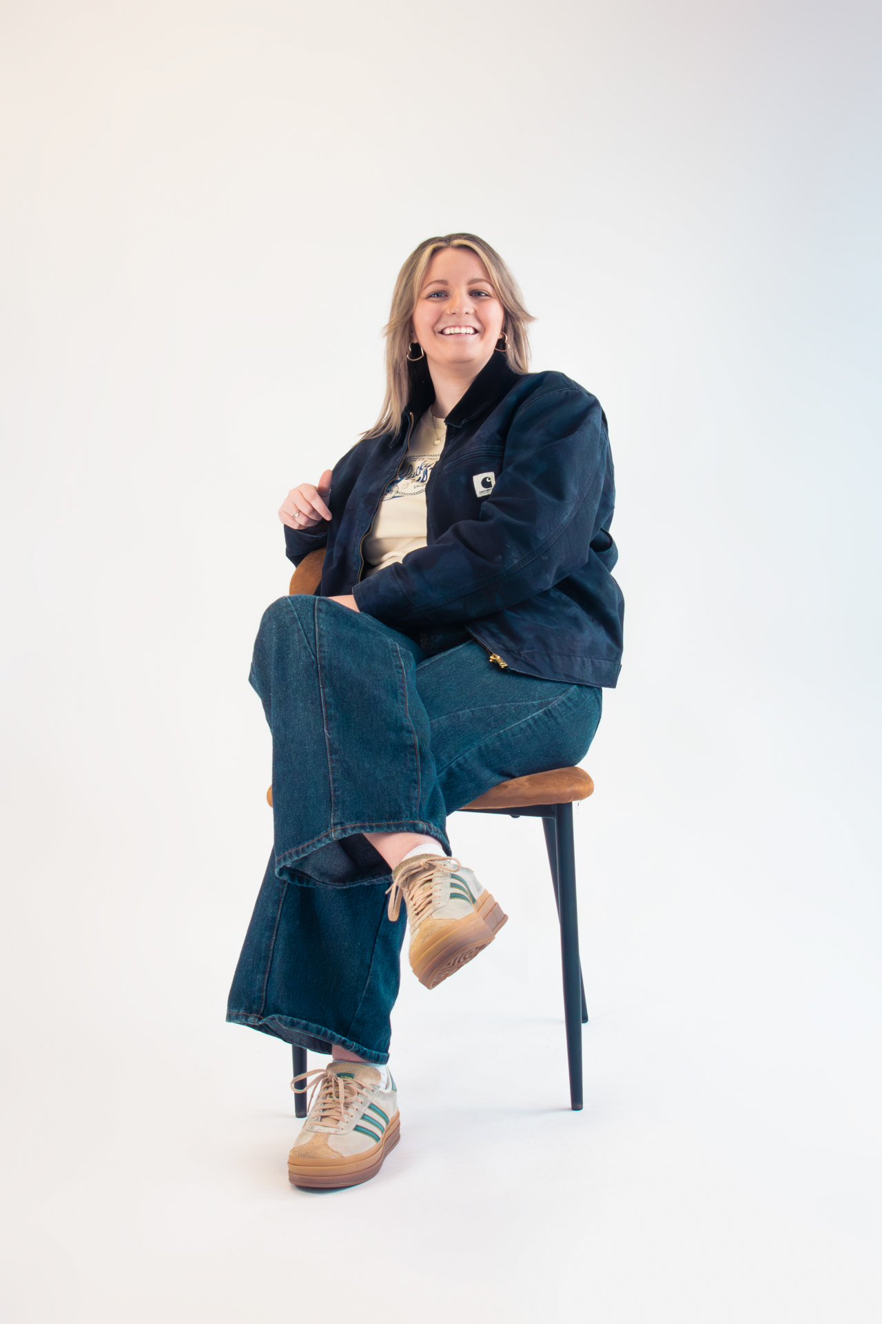
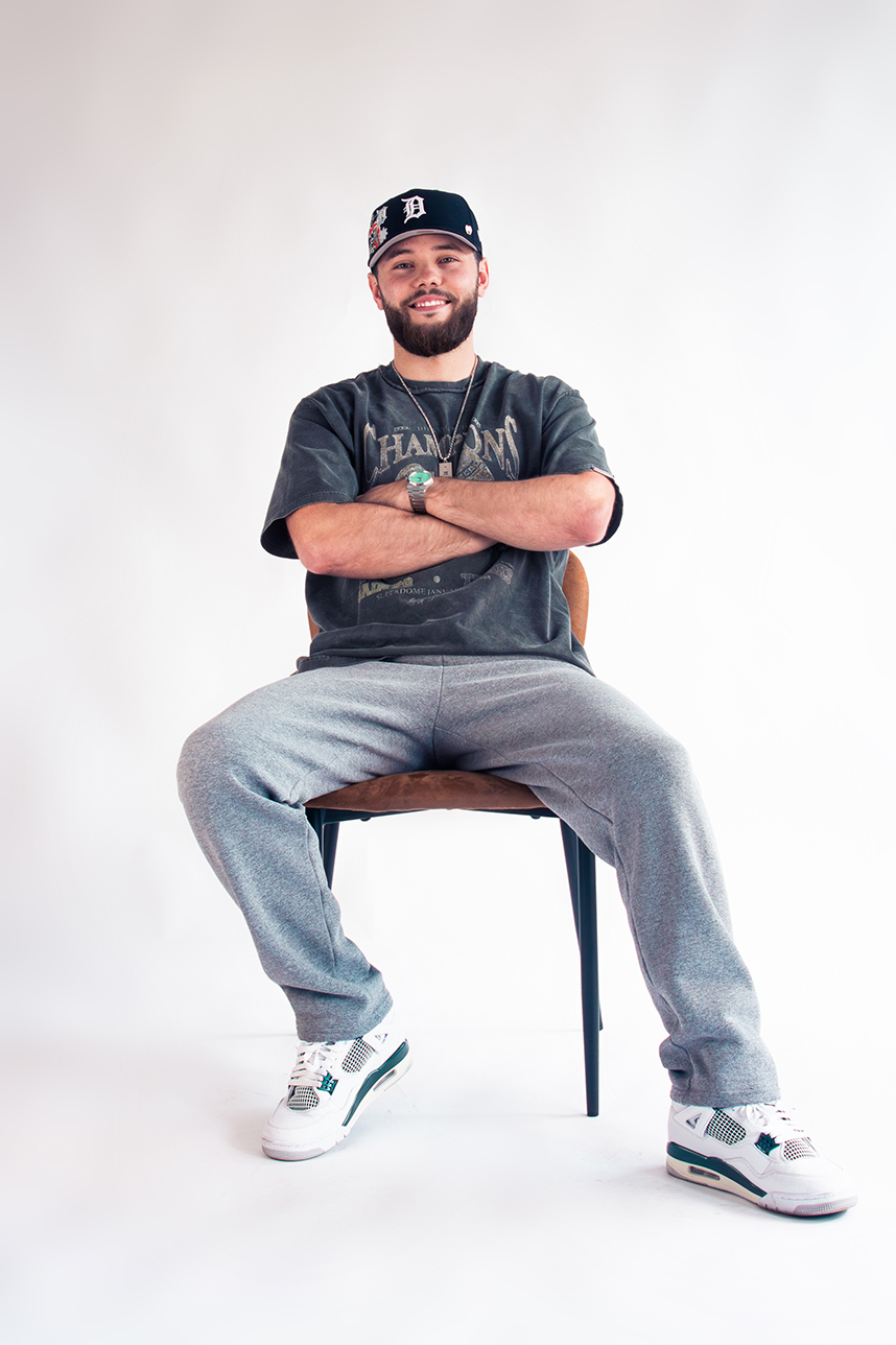
MEET OUR DESIGN TEAM
We collaborate with a curated network of best-in-class technology partners to deliver exceptional results for your online store. From seamless integrations to cutting-edge tools, our partnerships ensure you have the innovation and expertise needed to scale, optimise, and thrive in the competitive ecommerce landscape.

Every great relationship starts with a conversation, so schedule your call with us now and let’s find out how we can help you unleash your potential.

The Slice is our monthly newsletter, delivered straight to your inbox on a monthly basis. Receive the latest in ecommerce news, discover our latest work, insights to help you grow your business, and more.