
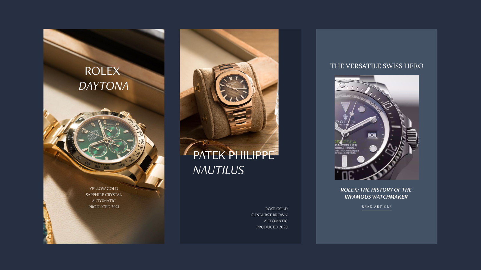
Sweeping Statement are a reseller of heirloom watches, jewellery, and handbags, stocking brands such as Rolex, Patek Philippe and Audemars Piguet. This means that their average order value is in excess of £10,000 and that the vast majority of their sales have historically been done in store.
However, upon their relocation from Hatton Gardens to Knightsbridge, they were suddenly surrounded by a number of similarly-valued, luxury brands, meaning that their branding wouldn’t stand out.
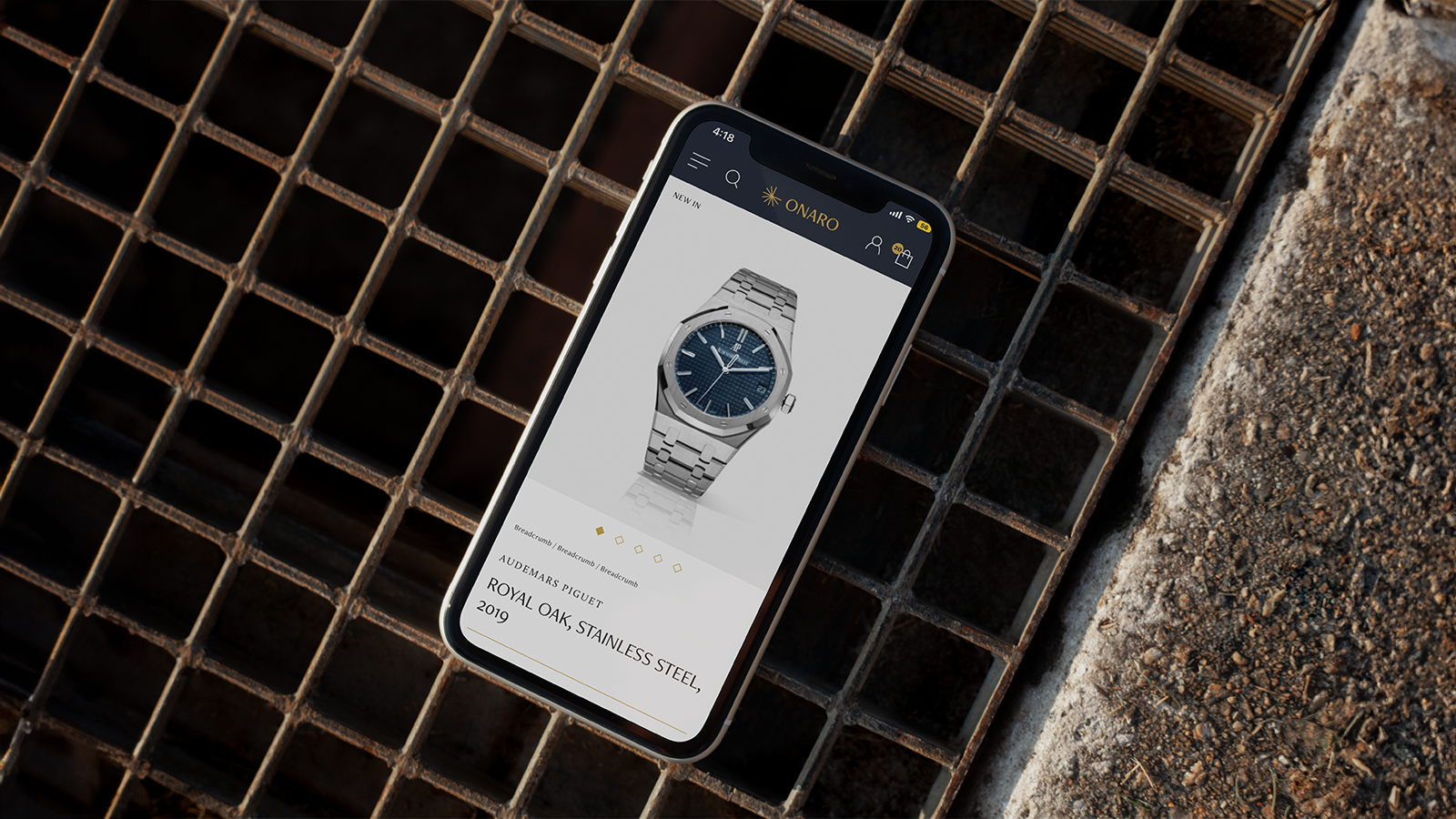
Plus, relying so much on in-store sales did stagnate the business’ growth, and the need for a purpose built ecommerce website grew more apparent with the company’s relocation.
Even if a new website didn’t promise an influx of new orders, Sweeping Statement needed a place to advertise their services and get new leads online.
Therefore, the web development and rebranding sides of this project had a focus on customer service, both in visually portraying Sweeping Statement as a brand that offered a luxury level of customer service, and in streamlining the experience for a customer online.

The key challenge was that, as part of their rebrand, Sweeping Statement were looking for a complete remodel - change beyond just a new logo or colour palette. Therefore, it’s worth acknowledging that any significant rebrand like this risks causing brand confusion, and a loss of brand equity.
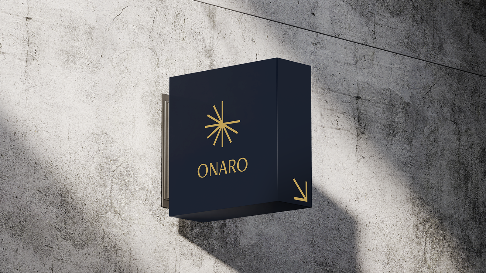
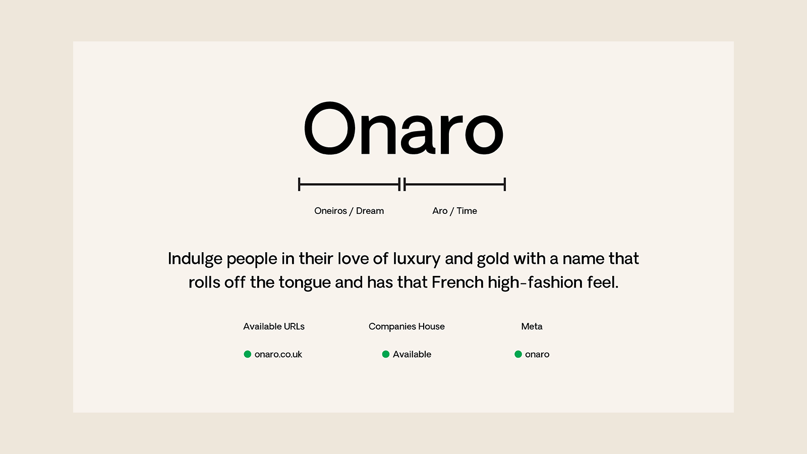
However, as this rebrand coincided with a relocation and new storefront, this was more like starting an entirely new brand from scratch. So, whilst the new branding would largely resemble Sweeping Statement, there was little need to retain too much of Sweeping Statement’s existing visual identity. We even ditched the name - Allow us to introduce, Onaro.
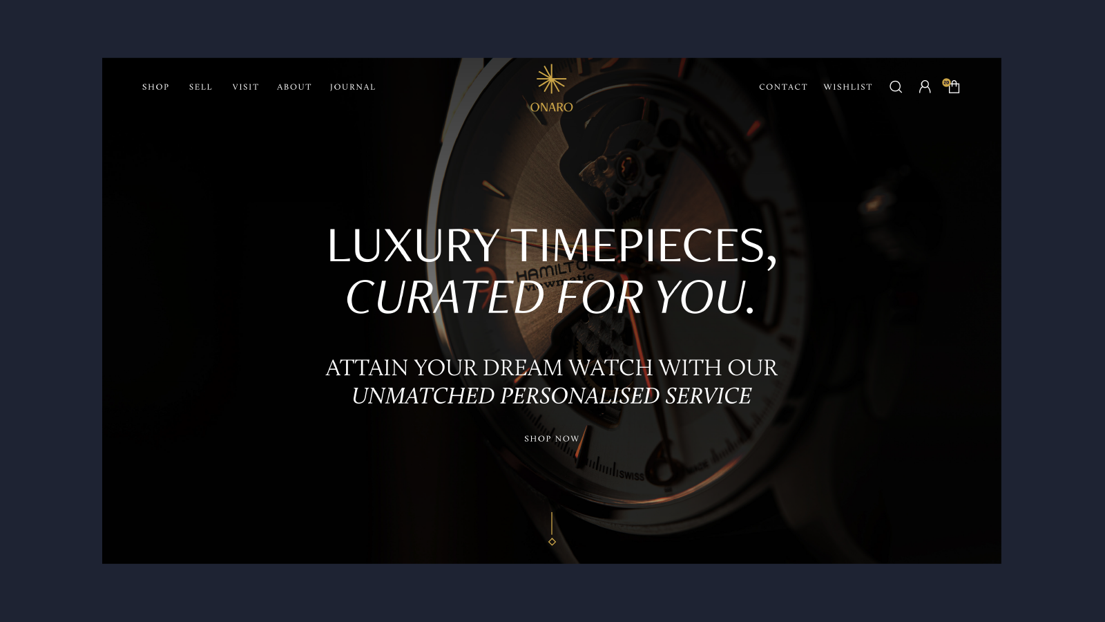
A new name. A new home. A new standard
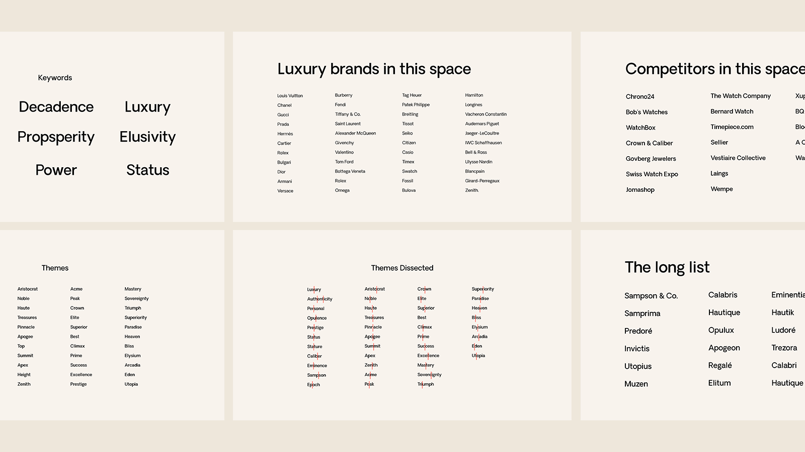
Onaro’s new branding was heavily built upon the statement “making the unattainable attainable,” from which everything else would be derived, including their logo, colours and brand imagery.
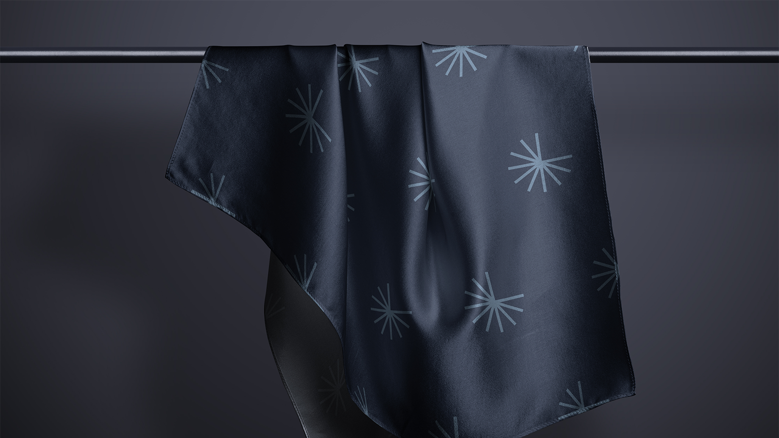
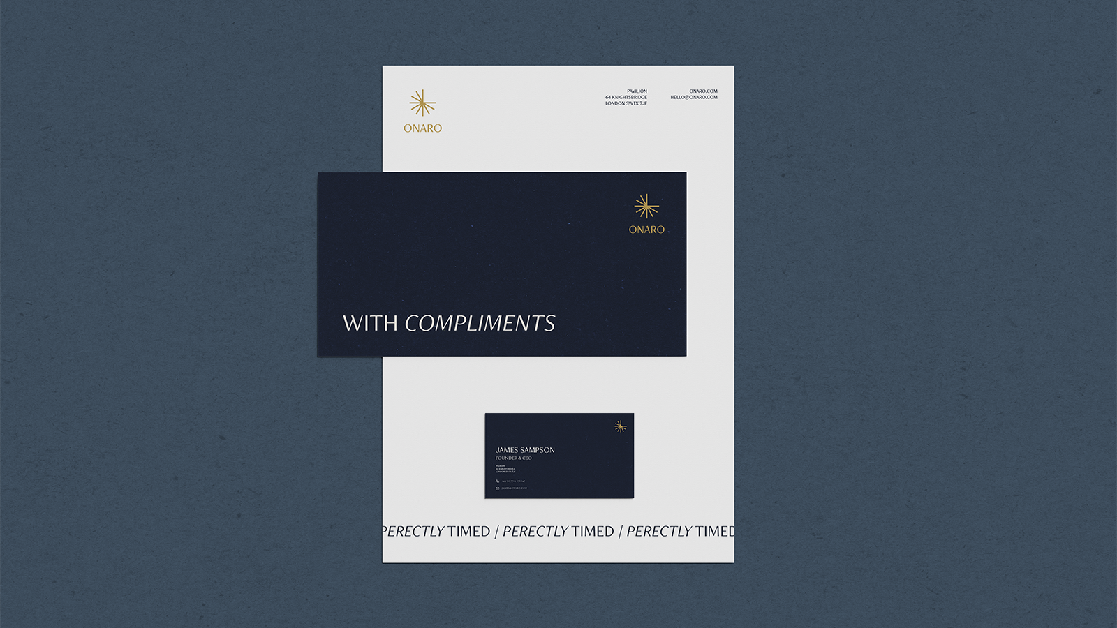
The new logo is an abstract representation of the 12 hours of a clock, with watch hands at 12 and 3, whilst also illustrating the idea of the spark or shine found from the quality of luxury goods. This new logo was fully responsive, meaning that it worked across all devices and layouts, at a range of sizes and resolutions. So regardless of if it was largely emblazoned in a shop window or tucked away in the corner of a social post, it always had an impact.
The colour palette that Onaro had used as Sweeping Statement had used white as its primary colour, with grey, yellow and navy blue as supporting colours. This colour palette had worked well for them, but needed a small update. We decided to promote blue to the brand’s primary colour, opting for three slightly different shades, with navy being the core colour, accented by gold. The navy and gold would be the core colours, with a 95:5 ratio being used across all communications, including their new website, social posts and in store.
We would expand upon this primary colour palette for their website
An equally important but often overlooked aspect of a brand’s visual identity is their typography. For Onaro, we opted for two fonts that the brand would use across their website and social channels; Freightneo Pro; a sans-serif typeface that drew inspiration from roman lettering, and Calluna; a chunky and assertive serif typeface. These would make up Onaro’s primary and secondary fonts respectively, with Freightneo Pro being used for all headings and body copy, and Calluna being used for subtitles, supporting copy, quotes, and calls to action.
Furthermore, the black and white product and lifestyle imagery would give an editorial and luxury feel to the brand. All of this was in service of portraying the 5-star-level of service that Onaro delivered; a well tailored and personalised experience.


Onaro now, not only have a new website to build their business, but an entirely new brand, and visual identity too, one that accurately and strongly positions them as the luxury service provider that they are.
Want to give your brand an uplift? Contact us to find out more about our design services.
"Working with Cake has been great. The process from start to finish was seamless. The whole team were amazing to deal with throughout and we could not be happier with the end result."
James Sampson - Founder & CEO, Onaro
Every great relationship starts with a conversation, so schedule your call with us now and let’s find out how we can help you unleash your potential.

The Slice is our monthly newsletter, delivered straight to your inbox on a monthly basis. Receive the latest in ecommerce news, discover our latest work, insights to help you grow your business, and more.