Arrow Gift Co. is an independent retailer of greeting cards and other gifting products. We were contacted by them in late 2023, as the brand had the goal of reinventing their website and wider brand identity as a whole.
Arrow Gift Co had an established Etsy presence already, but had recently started taking further ownership of their brand with a new Shopify site. However, being a relatively young brand, and one that didn’t have extensive experience with Shopify, they were struggling to get sales in a crowded market.
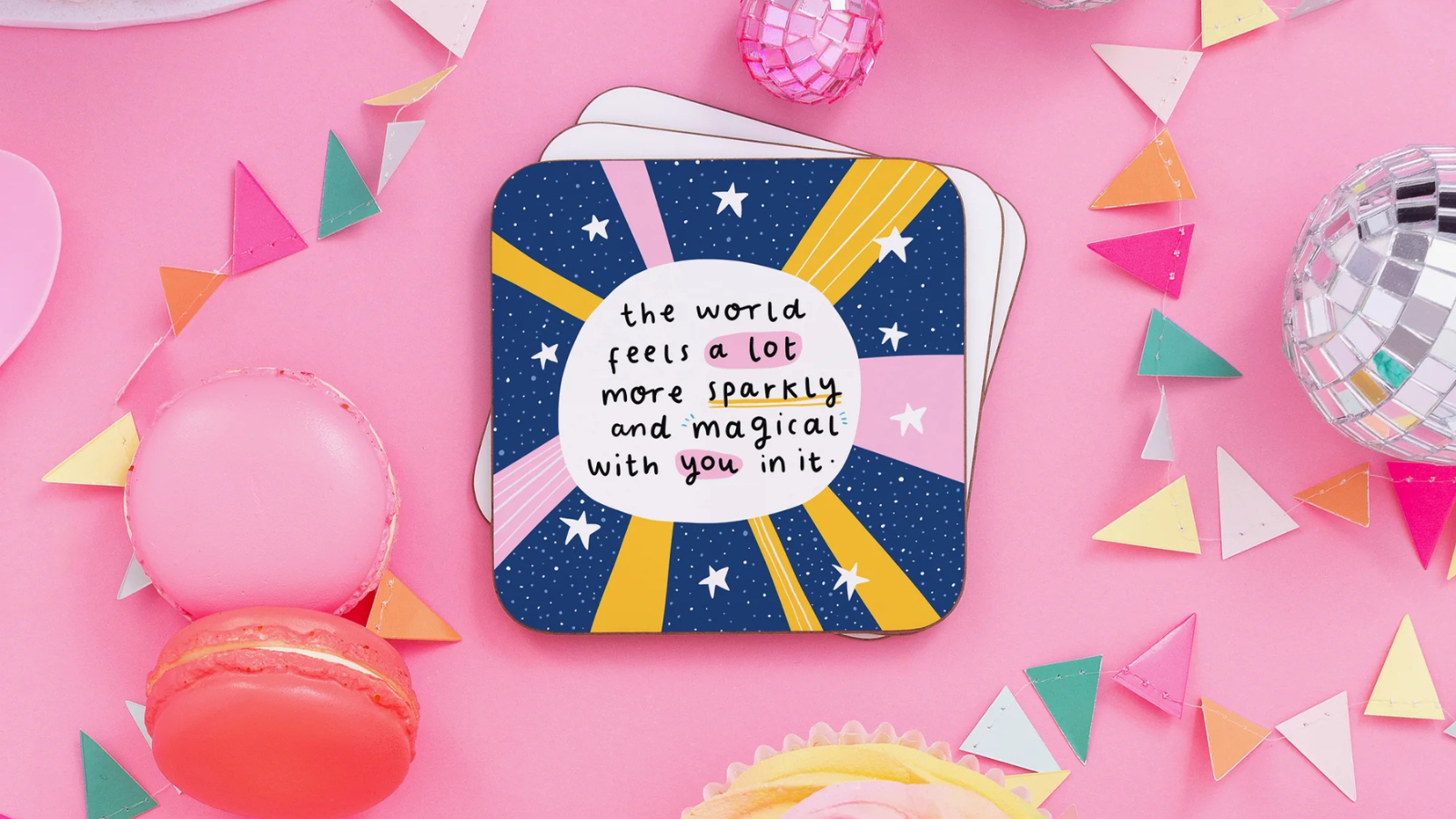
Arrow Gift Co only stock their own designs, and their product portfolio had a very consistent visual style. However, the brand had not yet relayed that unique personality into their website or wider online presence as a whole. And so, the brand needed a fresh coat of paint.
Although the brand had an established and unique product within their niche, designing a card and designing a website are two completely different beasts - as are writing copy for a greeting card and for a website.
Arrow had a ton of products for us to build from, each one giving us that bit more direction to how the brand should present itself. Plus, from talking to the brand owners, we were able to get a sense of their target audience, and how they themselves wanted to position the brand. It was then up to us to simply get our hands dirty.
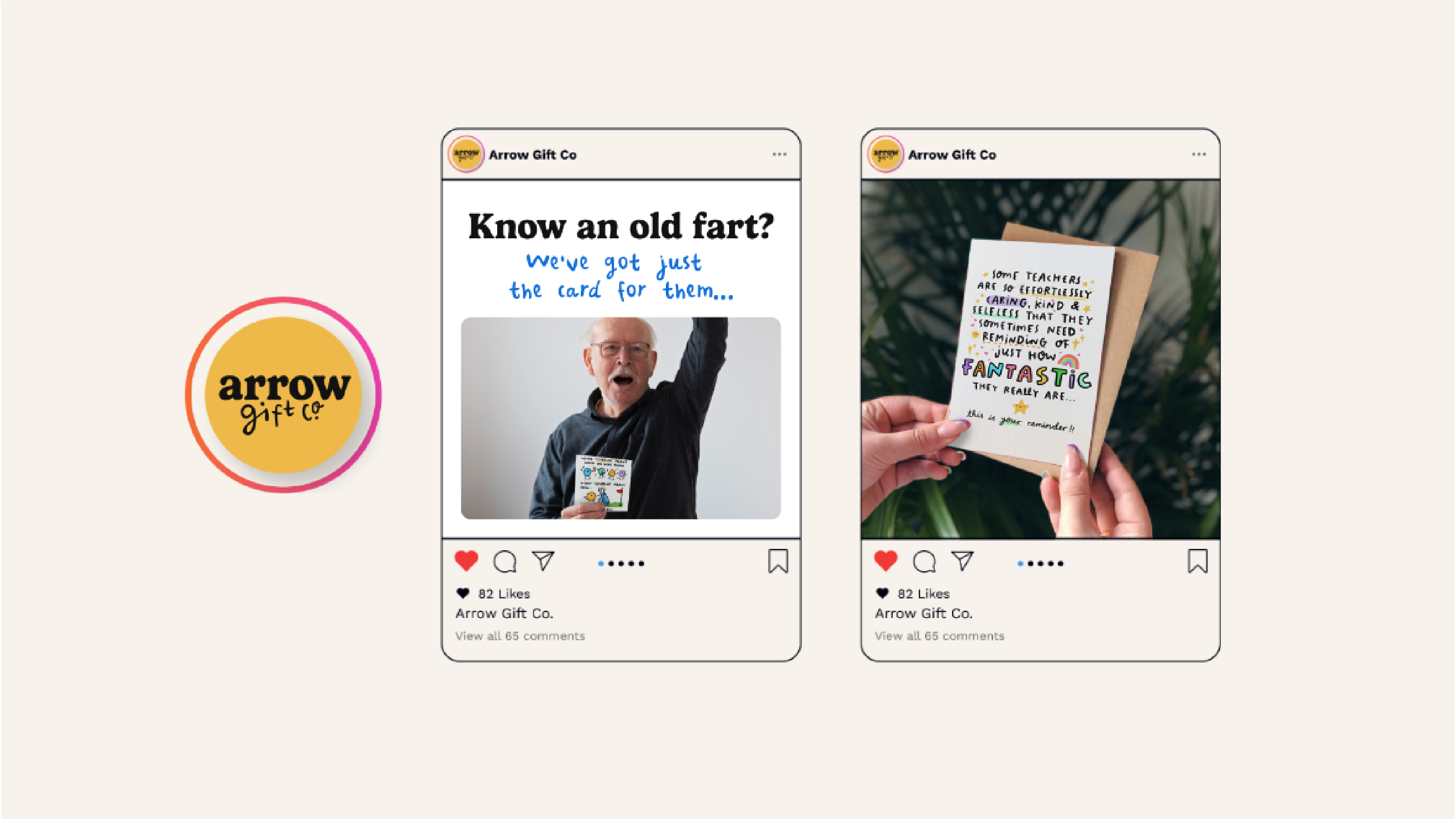
A tone of voice guide is designed to be a framework for a brand to follow when it comes to drafting copy for all outward-facing communications. Arrow Gift Co actively expressed their sense of humour through their products. Our mission was to do the same through their ecommerce site.
The tone of voice guide that we produced for the brand, ensured that the brand got this fun personality across, whilst clearly and accurately relaying the quality of their product offering too.
Through a series of example taglines, a brand thesaurus, and examples of the tone of voice in context, Arrow Gift Co were given a full framework that they could refer back to when writing copy for their brand.
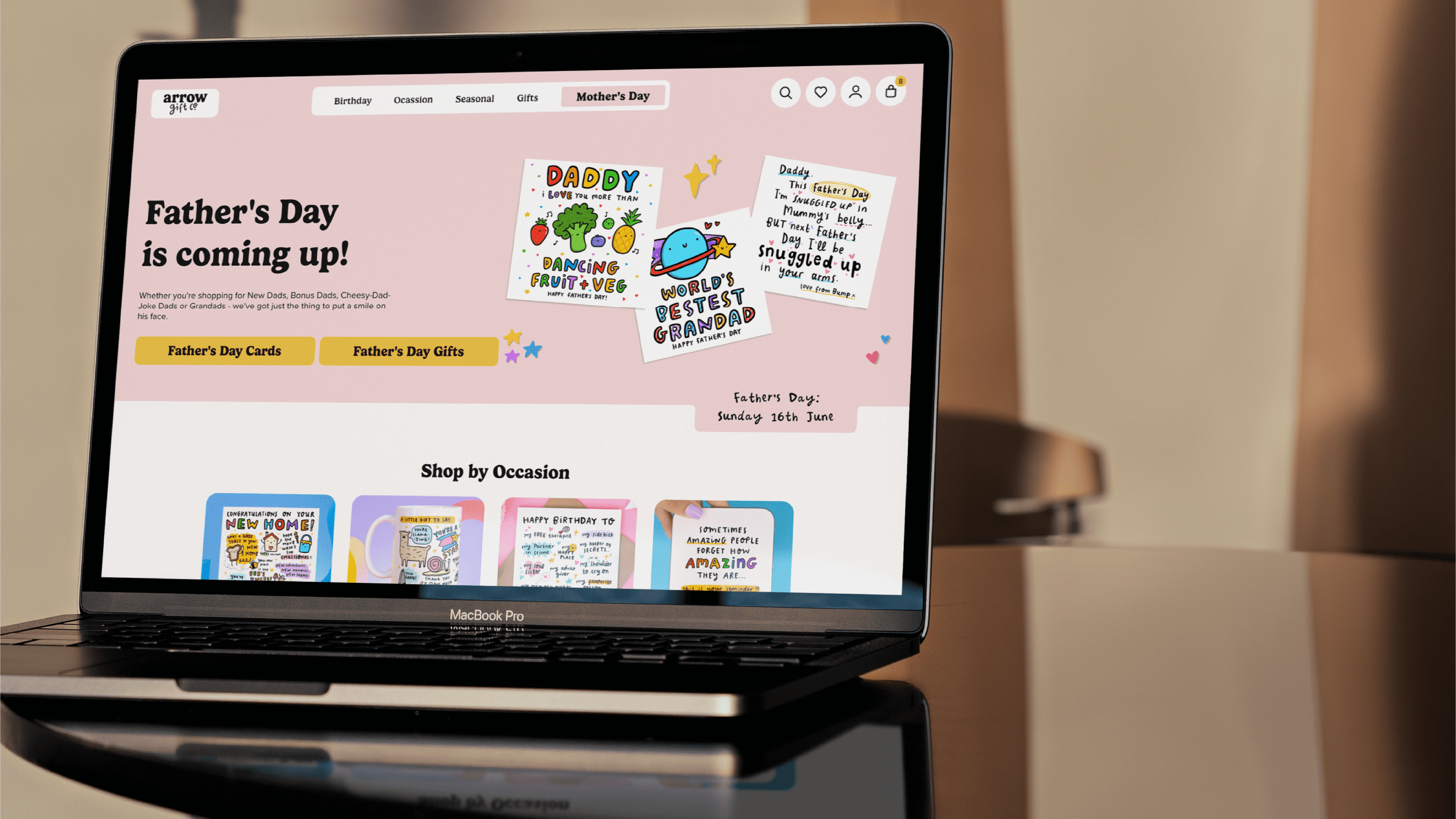
Similar to their website’s copy, Arrow seemed hesitant to relay their unique visual identity into their website. A lack of colour, and overly simplistic product imagery meant that customers were given a serviceable experience shopping on the site, but were unlikely to want to come back soon, had it not been for the products themselves being such high quality.
It was again a case of lifting that colourful and quirky visual style from their products and putting it into their website and other customer facing channels. This included everything from a slightly updated logo, colour palette, and typography, to creating all new visual touchpoints, graphical devices, and even an all new font.
Despite each of Arrow Gift Co’s cards having a colourful design, they were all on otherwise plain white cards. This compounded with the fact that the website used a lot of white too and made the brand feel quite clinical - not how they wanted to come across at all. With the new colour palette, we looked to create a fun, and diverse palette that worked well with the designs across Arrow’s stack of cards.
For the brand’s new typography suite we not only gave the brand a series of personality matching fonts, in Gelica and Proxima Nova for primary and secondary copy.
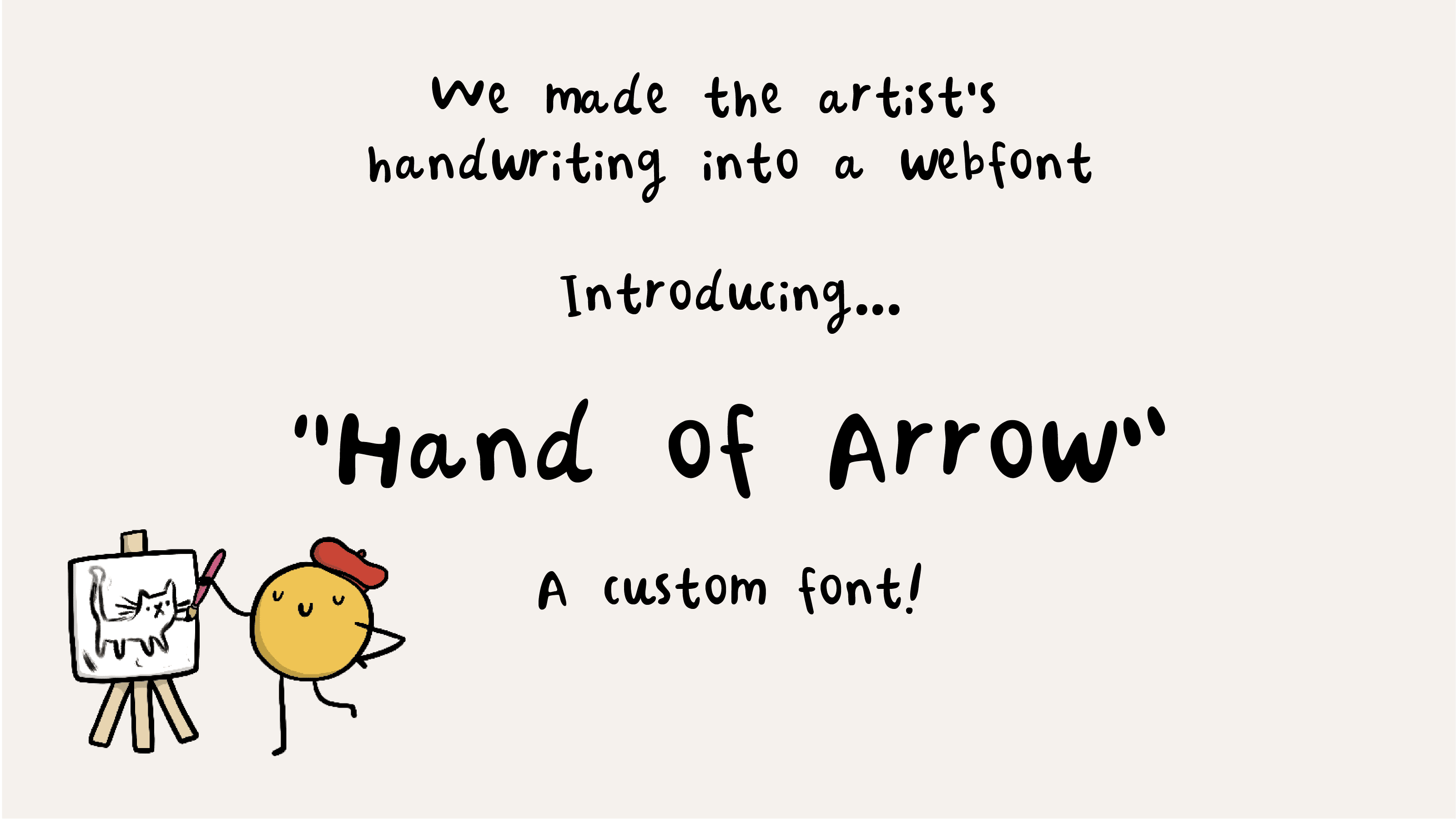
We also took the handwritten typography that was present across the brand’s products and greeting cards and built it into a font that the brand could use to type with - coining it the “Hand of Arrow.”


Fast forward a few months later, and Arrow’s new website is going live. Whilst we were in charge of designing the UI and UX for the website, the graphical devices, website content, and copy, was all handed back over to Arrow Gift Co
The brand more than reaped the benefits of their new site too. Before working with us, the brand was struggling to make more than a few sales a day through their Shopify store, but on launch day saw more than 50 - a number we only expect to grow and grow.
If you’re interested in a new brand suite, or are looking to take further ownership of your Etsy, eBay, or Notonthehighstreet store - Like Arrow were - contact us to see how we could help you out.
Every great relationship starts with a conversation, so schedule your call with us now and let’s find out how we can help you unleash your potential.

The Slice is our monthly newsletter, delivered straight to your inbox on a monthly basis. Receive the latest in ecommerce news, discover our latest work, insights to help you grow your business, and more.