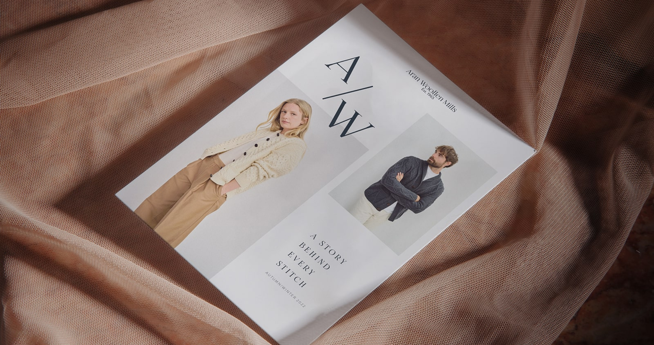
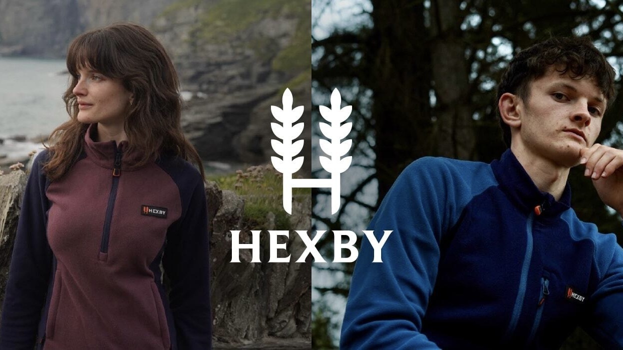
- Brand uplift
- Visual identity
- Asset design
- Creative direction
- UI design
Harrington Woodfuel (HWF) are a British producer and seller of high-quality firewood, and firewood burners. Not wanting to let their brand grow tired, and trusting us from having previously built their eCommerce site, HWF approached us looking for a fresh lick of paint to bring themselves into the modern day. Their eCommerce site had been a great success, however the continued growth had brought with it a younger, B2B clientele, most of whom were restaurant and bar owners, both nationally and internationally. So, as it was, their branding was beginning to look a little bit tired.
In addition to wanting their newly designed site to appeal more to this younger audience, HWF also wanted their store to be better designed for selling in the eCommerce market and to stand out amongst their competitors.

The Challenge
When making a start on this project, it became quite easy to see how HWF, and, in fact, how the majority of their competitors make use of largely indistinguishable design styles. After all, from a visual perspective, HWF have a largely plain product offering in firewood and wood kindling. Furthermore, as a family-run business, rather than a complete remodel of their branding, HWF were requesting more of an elevation of their branding, keeping a similar colour palette and the trade feel that their existing clientele had grown accustomed to.
So, there were quite a few restrictions being placed on our design team. However, to an experienced designer, placing restrictions on what you can do from a design perspective can actually lead to new creative expression. With a bit of creative thinking, these restraints actually help navigate through the problems, resources, and criteria of a project, forcing designers to be strategic and innovative so as to not recycle the same designs.
- Brand Visual Identity
- Creative Direction
- UI design
The Solution
In an effort to get an initial design prepared, we turned to the metaphorical dark side of design: generative AI. Whilst we would typically stay away from such a method, in this case it proved useful, as we merely needed a blueprint for Harrington Woodfuel to approve.
We were inspired by the photography style of Gilbert Bages, a wine photographer whose photography style revolves around making the subject use the product in non conventional ways, such as smashing bottles together or spilling glasses of wine. So, using Adobe Firefly, we entered prompts that would produce images of firewood being used in similarly non conventional ways. For example, a man juggling pieces of firewood, and a woman holding hot firewood with an oven glove, the primary idea was to make the photography more focused on individuals using the product, rather than focusing on the product itself.
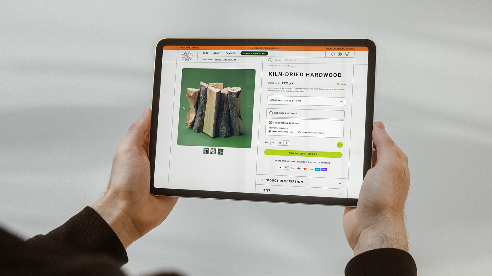
When it came to the design of the website, we made use of the recognisable kindling cross section shapes, such as square and rounded corner shapes, as icons and buttons throughout the website. The idea was to have a fun unique take on visually portraying the product.
We refined the brand’s existing colours of dark green, dark orange and brown into a more eye-catching and eCommerce friendly palette, using forest green, shoot green and fire orange. Furthermore we made some lighter swaps too, swapping the simple black and white to a slightly off black and white, in addition to adding in ash grey. The intention here was to retain the brand’s heritage whilst also bringing them into the new age.
In a similarly informed effort to retain the brand’s existing visual identity to some extent, we opted for the Trade Gothic font as the primary font of choice. Trade gothic is an irregular sans serif font whose spacing provides a lot of air, meaning that it works well with both more decadent and more extravagant fonts. We also utilised dividing lines, to give a more mechanical, blueprint feel to the design, and introduced some more eCommerce-esque button designs to increase the user experience and the ease of navigating the site.
Finally, we recategorised and refined their different product offerings, which had historically had no order to them outside of minor product groupings. We categorised their products into the four major categories: woodfuel, cooking, heating, and accessories, making it much easier to navigate the site for the new B2B buyers, but also for the existing clientele too.


The Outcome
Harrington Woodfuel Co. now have a visual structure to better support the eCommerce facet of their business, and better appeal to a more diverse, and aesthetically conscious demographic.
They now have a much more eCommerce ready, and, more importantly, modern brand identity that stands out amongst their competitors, translating into an improved user interface and increased interactivity.

Every great relationship starts with a conversation. We’d love to talk with you about your next project and answer any questions you might have about Shopify. But be warned… once we get talking about this stuff, it’s hard to shut us up!

.png)


.png)