Have you heard that Instagram are testing a 'full-screen' version of the feed?
This has been rumoured for a while, but we are seeing official testing starting early May ‘22.
From a UX point of view, this will mean big changes to the content on the feed, from both an organic and paid perspective.
What we know
So far, we know that, if this feed is implemented permanently, we can expect the following:
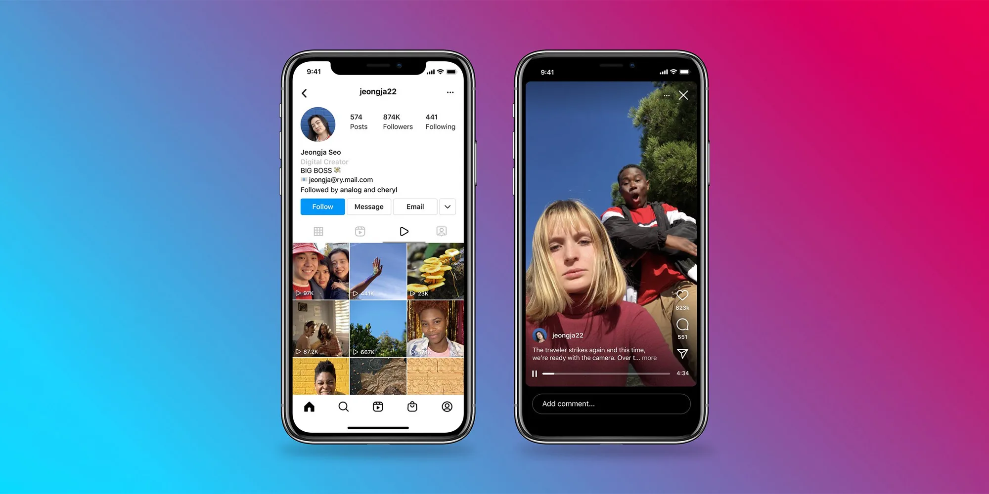
A portrait-first design
Content will be digested in 9:16, meaning content will have to be designed in this fashion - no more 1:1 or 4:5.
One at a time, please
Content will be digested one at a time, rather than seeing multiple assets at a time (as it stands), so we will see even more 'quick-swipe' behaviour, similar to TikTok - meaning video and sound will likely prosper.
Keeping UI in mind
The like, comment, share, and caption buttons are added to the video/ image, so there may be a larger 'buffer zone' of UI to avoid.
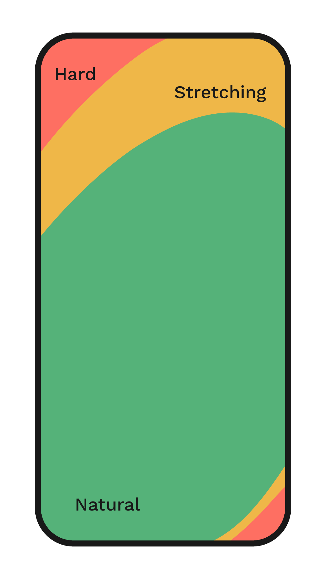
Easy-to-reach design
Stories will be shifted to the bottom bar (from the top), making it easier to click this feature with large screens. With mobile-technology getting larger, there are areas that are now harder to reach, and areas that users may have to stretch to interact with.
Despite this, once a user starts scrolling, the UI to click Stories disappears. Stories are one of Meta's most lucrative revenue streams, so this won't be disappearing any time soon, although we’re excited to see how this works. This means that stories will still be a focus and that designing for this placement may not change too much.
What we don't know:
- If this is going to be rolled out permanently
- If so, when this would be happening
Watch Instagram head Adam Mosseri xplain the feature.
At Cake, we will be keeping an eye out for any further developments on this front, however, be prepared to change how you create your organic content and advertising assets.
Subscribe to the our monthly newsletter to stay up to date with all the new innovations in the world of eCommerce.
.png)