
We recently attended a webinar with Klaviyo, our CRM platform of choice at Cake, discussing how to best design emails that convert. Here is a step-by-step guide to getting users to your site, and turning sessions into conversions.
Set an objective
The first step before starting is to ask 3 questions:
- Why am I sending this email?
- What is the goal?
- Who should get the email & why should they care?
This is a really good starting point as it helps to frame the content you include in the email. Once you've established these 3 factors, nothing should be included that steers away from this.
Leave it open-ended
It's easy to put all available information in to your email, thinking that this will help drive traffic to the site - but actually, it's the opposite. Leaving your audience wanting more information is what will drive them to click that CTA.
- Leave a bit of excitement.
- Encourage curiosity.
- Don't give away the full story.
- Leave it on a cliffhanger.
The key to this is to give the answers on the other side of the click.
Make it convert
Here is your check-list for making sure your email is designed to convert:
- Does it abide by the best practices of design?
- Does it have a clear and concise message?
- Does it provide value?
- Is it customer-centric?
- Is it clearly talking to a specific customer type?
- Does it find a problem?
- Does it provide a solution?
All roads lead to the CTA
There's no point in making a beautifully designed email if it's not driving users to your site, whether that's the blog, shop-all page, or a specific product/collection. We want to point customers in the right direction, and that's to click the CTA.
There are 3 recommended email layouts to do so:
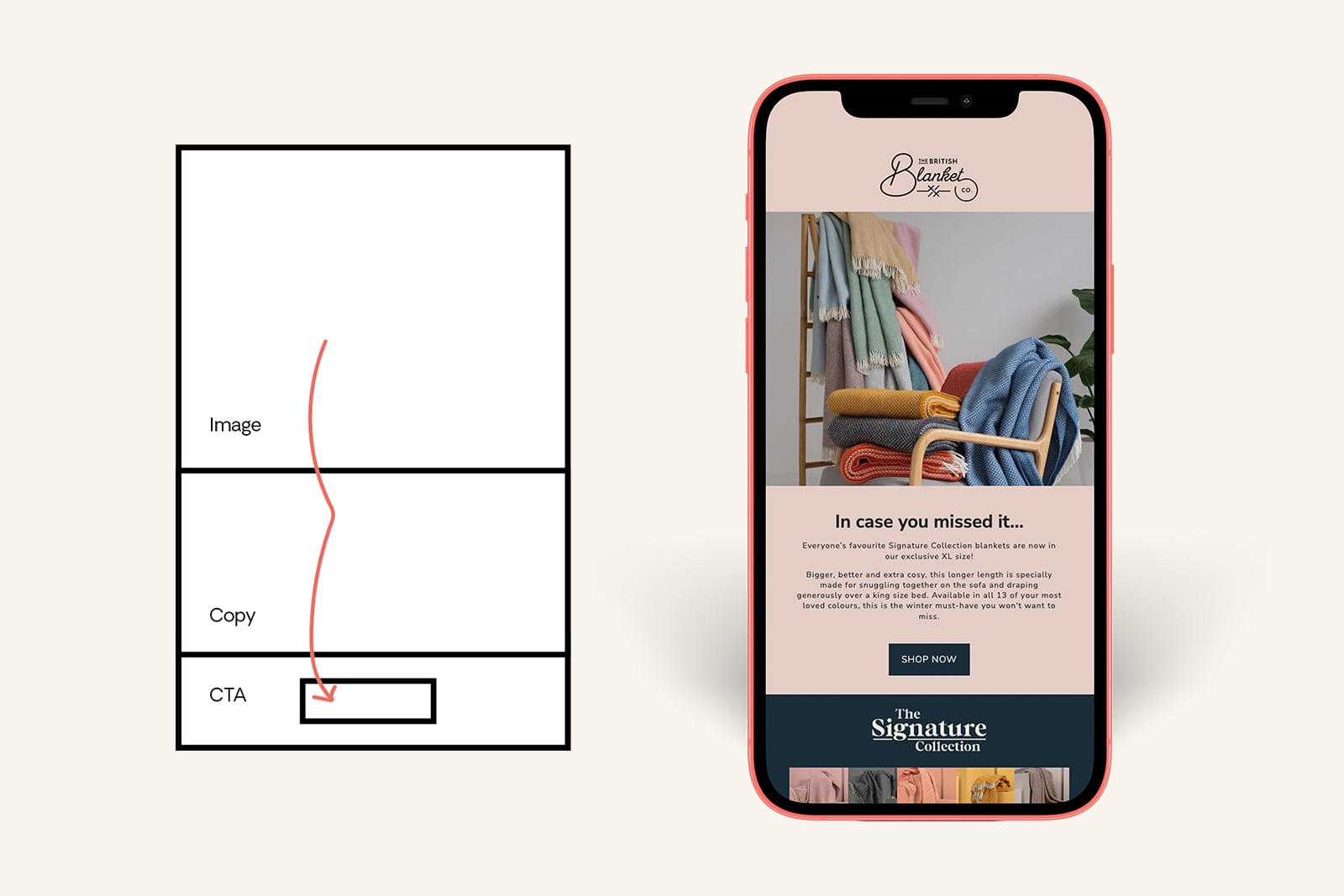
Inverted pyramid
This is great for simple emails with a clear and concise reason to click through. Start with a great image, introduce some context (a small paragraph of copy), and end with the CTA.
(Good for general conversion campaign emails)
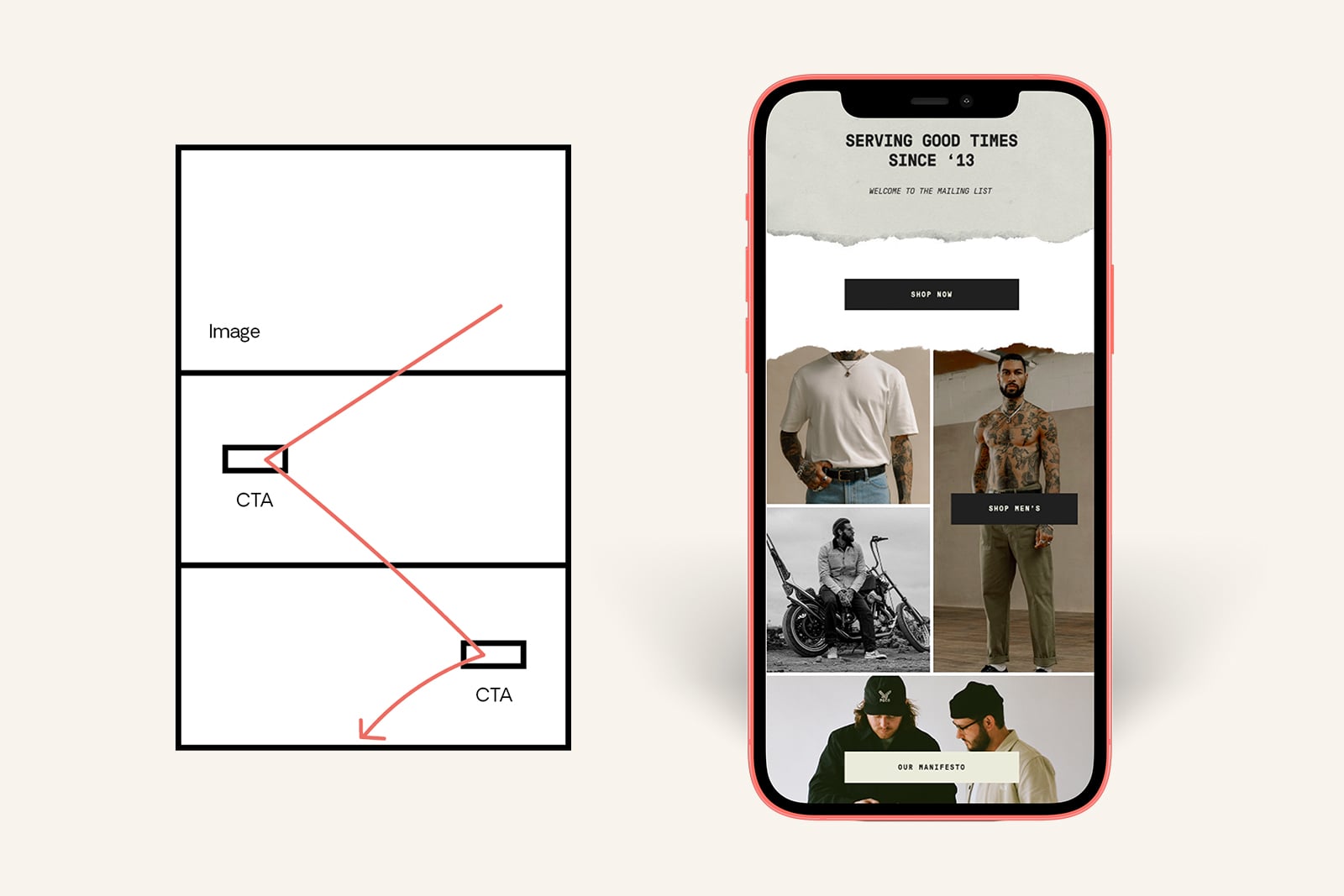
Zigzag
This takes the audience bouncing from one CTA down the email, giving users multiple opportunities to click through to the site, as well as a choice of where to go. In some cases, it may be better to let users choose between CTA 1 and CTA2 rather than CTA or no CTA.
(Good for products and collections)
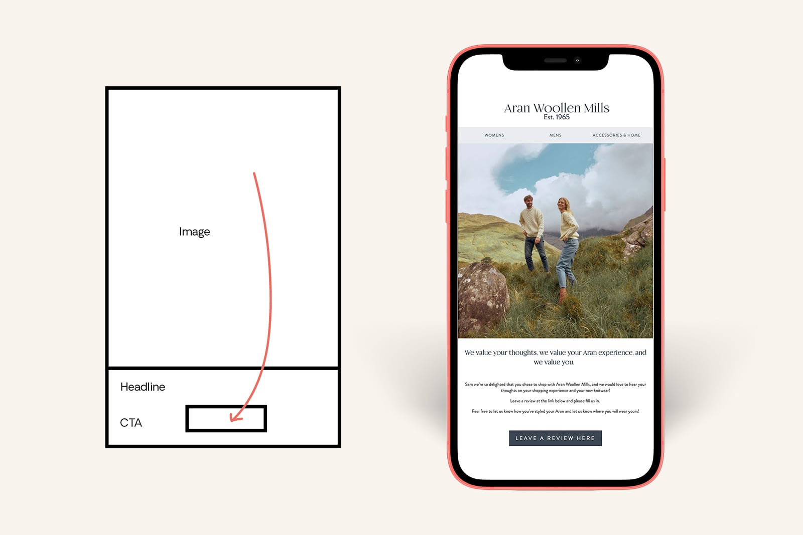
Single column
When you just want to let the image do the talking, a single-column layout will help to wow your audience without overwhelming them with too much to read. If it's not 'skimmable', people will not take the time to read your content.
(Good for blog/ content focused emails)
Craft a visual hierarchy
There's always so much we want to say about your brand and products that it can be hard to choose what to put in your emails, which can sometimes lead to a little bloating. One way to mitigate this is through 'The Squint Test'.
If you glance at your email design, do you get the gist? If not, it may be time to re-think the design and/or content.
Here are some ways to make it easier for your audience to read your emails:
- Have consistent layouts for regular customers - this way they know what to expect when they open your emails.
- Make all your email layouts scannable so that nothing is ever missed.
- Use colour to emphasise ideas.
- Choose designated sizes for headers, body & stay consistent.
- Embrace the white space (especially around important information and CTAs) - this way your audience's eye will be drawn to the one vital piece of info, at the very least.
Maintain brand consistency
Keep your brand at the forefront of your emails. You want users to open your emails and know exactly who they're looking at without reading a single word.
This is how to do it:
- Create and maintain base templates.
- Always refer to the brand guidelines.
- Match social icons to branding.
Write clearly & concisely
Don't overcook it. Keep it simple, and make it stick.
Here's how:
- Keep in line with your brand's TOV.
- Get to the point - don't hide your message in the waffle.
- Solve the problem (again).
- If it's not essential, cut it out. It's ruthless, but even after you've written the most beautiful copy ever, it may just be that little bit too wordy or convoluted. Cut it out (but keep that copy somewhere, it might be useful for later!)
- Be bold.
Here are some ways to make your copy impactful:
- Use copy to describe what the images can't.
- Avoid long paragraphs (5 sentences max).
- Use action-oriented text.
- Make the reader the star of the show.
- Get personal (you can target specific audiences, so tailor your messages).
Use images to tell your story
We are all visual beings: a picture speaks 1000 words. Lean into the imagery our clients have, and don't overcook it!
- Start with high res image.
- Keep the image full width of the email.
- Use directional cues to drive readers towards CTA (reverted pyramid, zigzag, column).
- Use GIFs!!!
Design for mobile
Self-explanatory. Be mindful of text on imagery as this shrinks on mobile and pay attention to the button size!
Reach out for support
If you're struggling to implement these top tips, feel free to reach out to a marketing and design specialist, such as Cake, to help get it right!