.jpeg)
In the increasingly crowded digital marketplace of ecommerce, a great product isn’t enough to stand out. Today’s most successful ecommerce brands need to connect with their customers. And what connects? A strong, consistent brand experience across every touchpoint. From your social ads to your in-store experience and crucially, your eCommerce store, customers expect your brand to feel authentic at every stage.
What is brand expression?
Brand expression is more than a logo or a colour palette, it’s the sum of your tone, visuals, interactions, packaging, and even your UX. It's how your brand shows up, speaks, and behaves everywhere it exists. The best brands don't just tell you who they are, they show you consistently. Let’s dive into six standout ecommerce brands that absolutely nail brand expression across the board, and unpack what makes them work.
Why does a stand out visual identity matter for your ecommerce site?
Your ecommerce store isn’t just a place to transact, it’s your brand’s most powerful storytelling tool.
In a world where people scroll fast and attention is limited, a strong brand experience:
Builds trust: Consistency across all touchpoints makes your brand feel reliable and credible.
Drives loyalty: Customers come back to brands they feel something for.
Cuts through the noise: A clear identity helps you stand out in a sea of sameness.
Supports omnichannel growth: When your brand feels cohesive across touchpoints, from TikTok ad to checkout page, customers experience less friction and more connection.
1) Vacation Inc.

The ecommerce store of Sun cream brand, Vacation Inc, is a love letter to retro, sun-soaked leisure. Think 1980s poolside glamour meets modern sunscreen. From the moment you land on the site, you're not shopping for SPF, you're entering a nostalgic fantasy.
What makes Vacation Inc’s ecommerce site stand out?
Visual identity: Vacation Inc’s vintage-inspired packaging flows effortlessly onto the site, with playful touches like newspaper-style discount tokens that mimic nostalgic coupons, and product figure tags that recall the charm of old Argos catalogues.
Tone of voice: Every product description, pop-up, and CTA of Vacation Inc’s site feels like it's been pulled from an old Miami travel ad. It’s playful, self-aware, and totally immersive.
Offline cohesion: Vacation Inc’s in-store displays and packaging carry the same retro flair, making the brand instantly recognisable whether you’re online or browsing in a boutique.
Key takeaway: Use every pixel of your ecommerce store to reinforce your brand’s world - from the footer copy to the 404 page. Make it feel like a customer’s stepping into your universe.
2) Fly by Jing
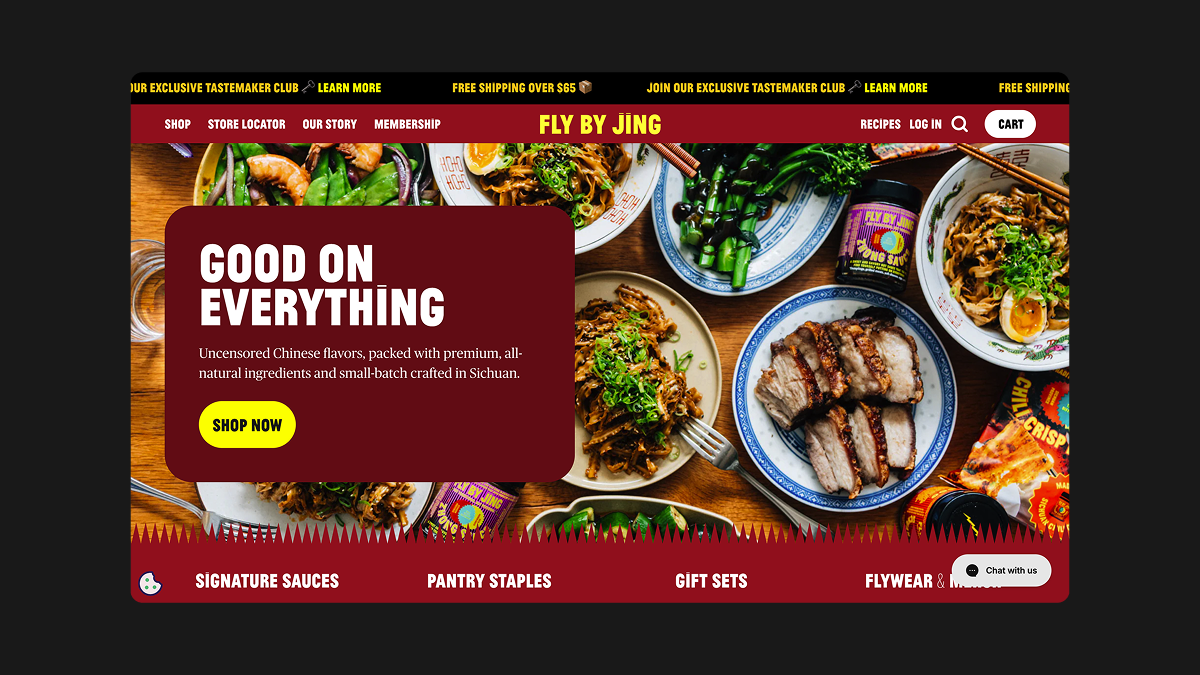
Fly By Jing is a modern Chinese food brand that’s bold, unapologetic, and full of flavour, both in taste and design. Their website captures this energy perfectly, using punchy colours and an energetic tone to mirror the product’s intensity. Every element, from the palette to the copy, reinforces their heritage and individuality. They don’t play it safe or dilute their identity, they amplify it, offering a bold and immersive experience from the first scroll.
What makes Fly by Jing’s ecommerce site stand out?
Strong cultural narrative: The Fly by Jing brand celebrates Sichuan flavours through a contemporary lens, and that cultural richness runs through everything. From the bold storytelling on their packaging to the copywriting on product pages, the playful names, the design of their bundle offers, the stylised photography, and even their site’s scroll animations. Every interaction reinforces the same vibrant story of flavour and heritage, creating a truly cohesive brand experience.
Vibrant design: Everything you'd typically be told not to do, Fly by Jing have done it and it works! Bold red, gold, and black create an unmistakable palette, accented with dynamic layouts, scroll-triggered animations and over-sized comedic-like buttons that bring the brand story and the product’s flavours alive.
Advertising alignment: Fly by Jing’s paid social, influencer collaborations, and pop-ups all echo the same spicy, high-energy aesthetic and tone of voice attracting both new and existing customers creating that important cohesion across all touchpoints.
Key takeaway: Don’t water your brand down to appeal to everyone. Embrace your roots, your story, and your edge. When you do, your ecommerce store naturally attracts the audience you want.
3) Houseplant
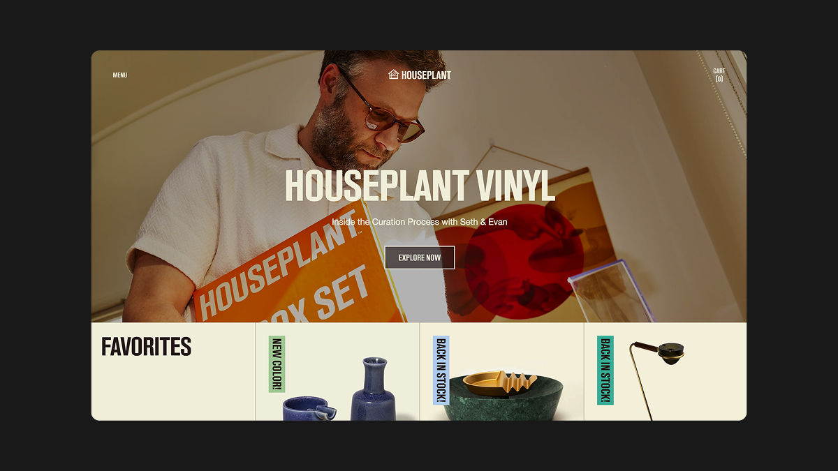
Seth Rogen’s Houseplant brand is more than just a cannabis company, it’s a masterclass in brand expression. Every corner of their website reflects a carefully curated lifestyle, rooted in design, ritual, and creativity.
The web experience is about more than just products; it's about how the brand makes you feel. You're not just shopping, you're entering a space where design is celebrated, everyday items are elevated, and the brand's identity comes through in every scroll.
What makes Houseplant’s ecommerce site stand out?
Editorial feel: Houseplant’s ecommerce site reads like a high-end design magazine, the clean, minimal layouts, bold typography, and rich lifestyle imagery all reflect the thoughtful architecture and design behind each product, reinforcing their elevated, intentional brand world.
Product as art: Houseplant’s product library takes centre stage, showcased through large, spacious product cards that let each item shine. From lighters to ashtrays, every object is captured with the care and detail of a collectible, elevating everyday items into design icons.
Omnichannel expression: Houseplant’s pop-up shops and brand partnerships mirror the same attention to detail, design-led tone, and creative play found on their site. With curated displays that resemble the product galleries, to packaging that reflects the brand’s distinctive visual style, and collaborations that share the same appreciation for the modernist aesthetic. Each real-world expression of the brand feels like a natural extension of the online experience, maintaining the same intentional design language and cultural tone.
Key takeaway: Treat your website like a gallery for your brand. Make each product and interaction feel intentional and on-brand. Your store should express not just what you sell, but why it matters.
Bon Bon Bon
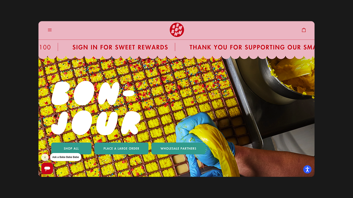
Bon Bon Bon makes chocolate weird in the best way possible. Based in Detroit Michigan, their whole vibe is handmade, offbeat, and full of joy. But it’s not just about quirky packaging or fun flavours, Bon Bon Bon’s brand identity is baked into the very bones of their website. The bright, rebellious colour palette, hand-drawn illustrations, and cheeky tone of voice all work together to create a playful, unmistakable world. Their online store feels like an extension of their chocolate-making philosophy, handcrafted, joy-first, and always a little unexpected.
What makes Bon Bon Bon’s ecommerce site stand out?
Visual quirk: Bon Bon Bon’s site embraces a joyful kind of disorder. Hand-drawn icons, raw textures, and cheeky product names all contribute to a sense of handcrafted charm. Oversized design elements, such as its core Add to cart buttons and an unconventional layout, add to the playful unpredictability, making the online experience feel just as unique as their chocolates.
Understanding their audience: We always design sitemaps with the end user in mind to ensure your customers are converting, and Bon Bon Bon clearly does too. They understand their customers want to dive straight into the shopping experience, which is why the homepage features bold, engaging product highlight blocks that double as mini product pages. It's an intuitive layout that puts the chocolate front and centre, right where it should be.
Key takeaway: Let your brand's weirdness show. If your brand is fun, be fun. If it's raw and real, show that. Don’t flatten your personality for the sake of "looking professional."
Roarsome
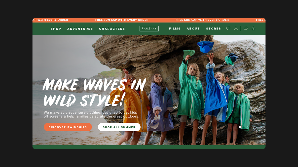
Roarsome is a vibrant, energetic brand dedicated to inspiring kids to explore the great outdoors and disconnect from screens. Specialising in durable, fun, and comfortable clothing designed for active children, their ecommerce site brings this mission to life with playful visuals, engaging copy, and a layout that encourages exploration. Roarsome’s ecommerce experience reflects its commitment to helping kids lead active, outdoor-focused lives, making it easy for parents to shop for functional and stylish clothing that’s built for adventure.
What makes Roarsome’s ecommerce site stand out?
Cohesive with real-world stores: The Roarsome site radiates playful energy through bold, vibrant imagery that highlights their clothing in action. The design draws inspiration not only from the clothing itself but also from the dynamic interiors of their stores and pop-up spaces. With elements like oversized textures, energetic shapes, and striking details, the site creates an immersive sensory experience that mirrors the excitement of their physical locations.
Curated Lifestyle: Roarsome’s higher price point is justified by a carefully curated lifestyle that appeals to parents seeking both quality and adventure. The brand doesn’t just sell clothes; it promotes a premium, outdoor-focused lifestyle. Through photography that showcases children enjoying nature and playing outdoors, Roarsome positions itself as an aspirational brand. This imagery highlights the freedom and connection with nature, creating a strong emotional appeal and reinforcing the value of its premium products.
Understanding Audiences: Roarsome faces the challenge of appealing to both parents and kids, and they’ve nailed the balance. For parents, the site clearly presents the technical details they need, with a smooth and efficient user journey. For kids, it’s a playful, engaging experience, featuring large buttons, animated characters, and vibrant colours that keep them entertained and involved throughout the shopping process.
Key takeaway: To create a successful ecommerce experience, it’s crucial to balance the needs of your different audiences. This means understanding the specific motivations, preferences, and behaviours of each group you are targeting.
Simple Complex
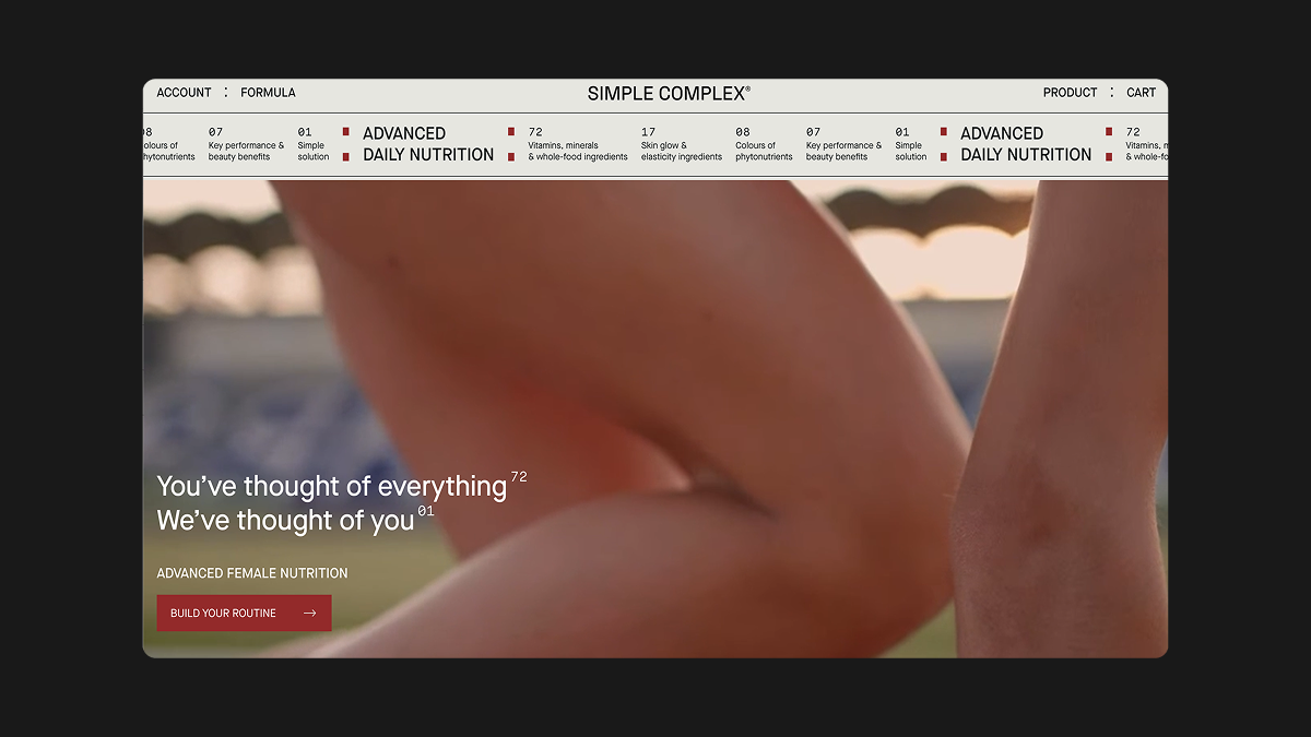
Simple Complex sells elevated everyday essentials for health gurus all backed by science, and their brand expression is just as considered as the products they sell.
What makes Simple Complex’s ecommerce site stand out?
Less is more: Simple Complex’s ecommerce site is minimal yet warm, building trust within a market people can be hesitant about, built with purposeful spacing, rhythmic flow, and a thoughtful grid layout that gives every element room to breathe. It’s a modern, balanced design that feels calm but still full of character.
Clear hierarchy: Thoughtful typography and muted tones put the focus on Simple Complex’s product library without the distraction of other elements.
Cohesive marketing: Email campaigns, product packaging, and even their shipping confirmations feel like they’re part of the same design system, which is great because it ensures a seamless brand experience for the customer, regardless of where they interact with the brand. This level of cohesion fosters trust and strengthens the overall perception of the brand, making every touchpoint feel like an integral part of a larger, well-thought-out system.
Key takeaway: Consistency doesn’t have to mean boring. A clean, refined brand identity can still evoke emotion, especially when every detail is deliberate links to the best destination.
Making your site stand out
Each of the brands listed here understands that visual expression is everything. It’s not about being flashy or loud, it’s about being you, clearly and consistently, across every touch point.
Your brand isn’t just your logo. It’s your voice, your UX, your photography style, your packaging, your checkout confirmation emails, and your store.
If your ecommerce site isn’t pulling its weight in the brand department, we can help. From site strategy and design to brand development and storytelling, we bring brand-first thinking to every ecommerce project.
Ready to build a site that feels like your brand? Get in touch and let’s make something unforgettable.