Go Thrift are one of the biggest independent eBay Sellers in the UK, with a specialism in curating and upcycling second hand clothing
Go Thrift were looking to take the next step. With the goal of using their eBay presence to launch a new ecommerce store of their own, Go Thrift needed a visual identity that would appeal to a diverse customer base. Naturally, the brand turned to us for support.
Despite building themselves a loyal customer base, by only selling on the marketplace platform eBay, it wasn’t a customer base Go Thrift owned. This meant they couldn’t send their customers emails or take advantage of other retargeting tools. As a result, Go Thrift wanted to launch their own direct to consumer ecommerce store.
The only problem? They had little online presence and no established visual identity.
One of the biggest challenges in this design project was the need for the new visual identity to appeal to two very distinct audiences.
We needed to develop a confident brand identity that would resonate equally with both audiences, whilst ensuring each touchpoint remained coherent.
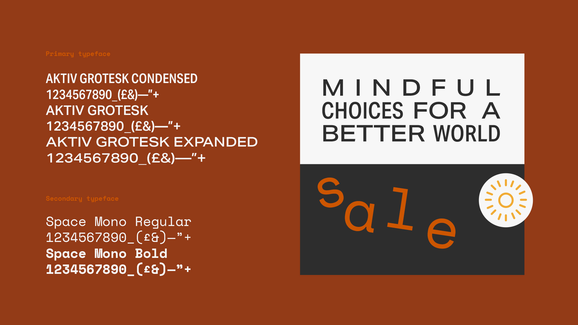
The two things we prioritised when developing the Go Thrift brand identity is Movement and prioritisation. The
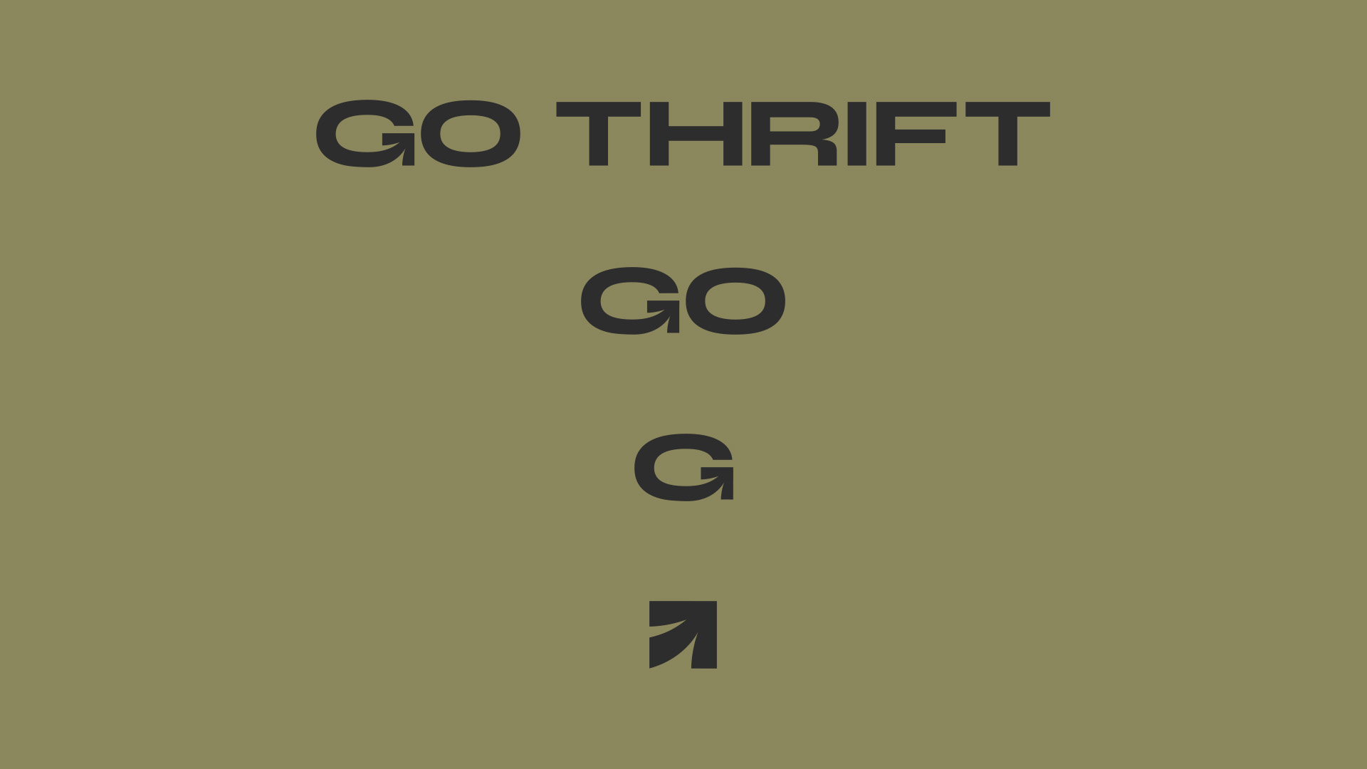
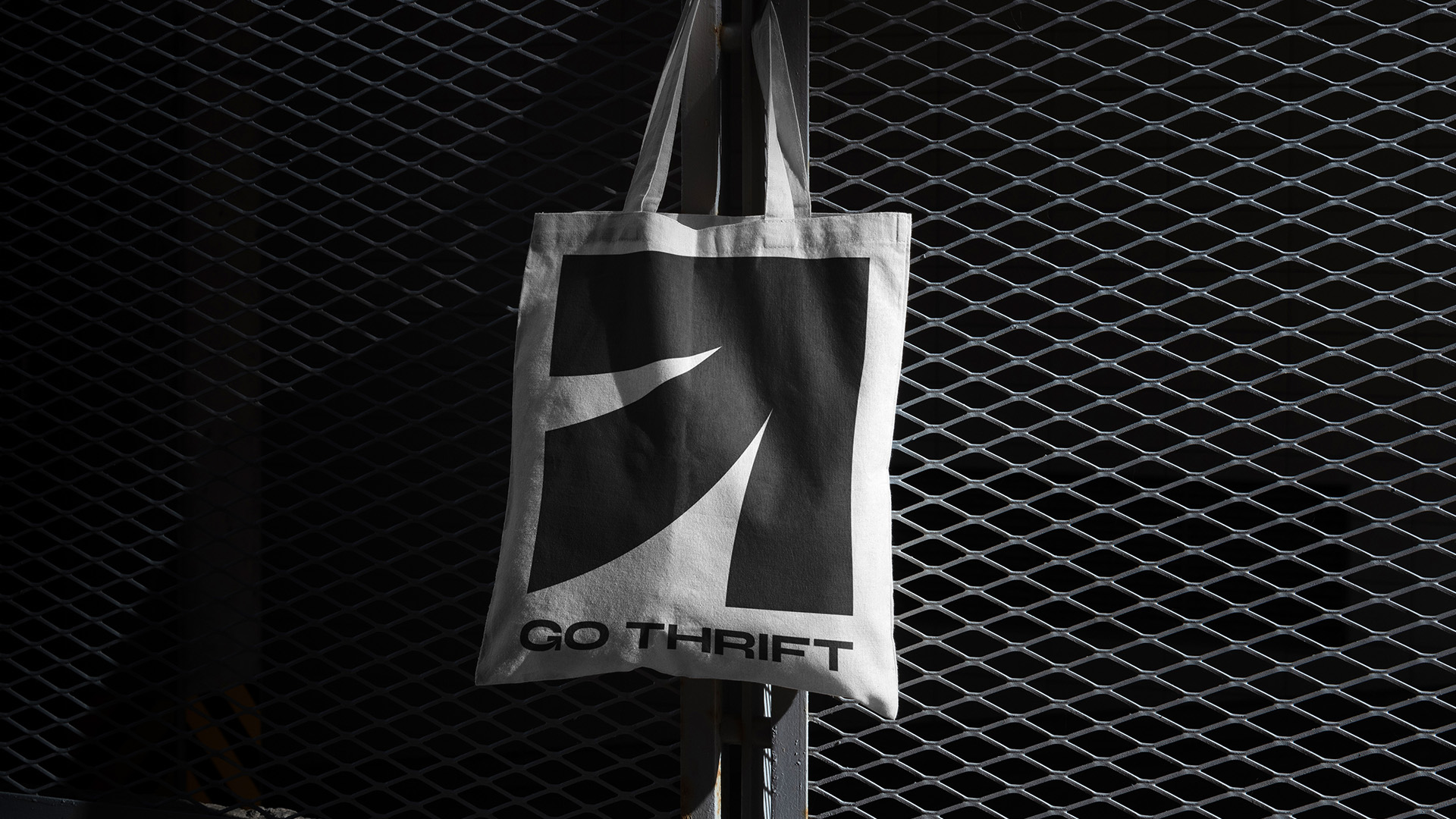
Much like the product offering of the business, the visual identity plays on retro elements but has been reimagined for the modern day.
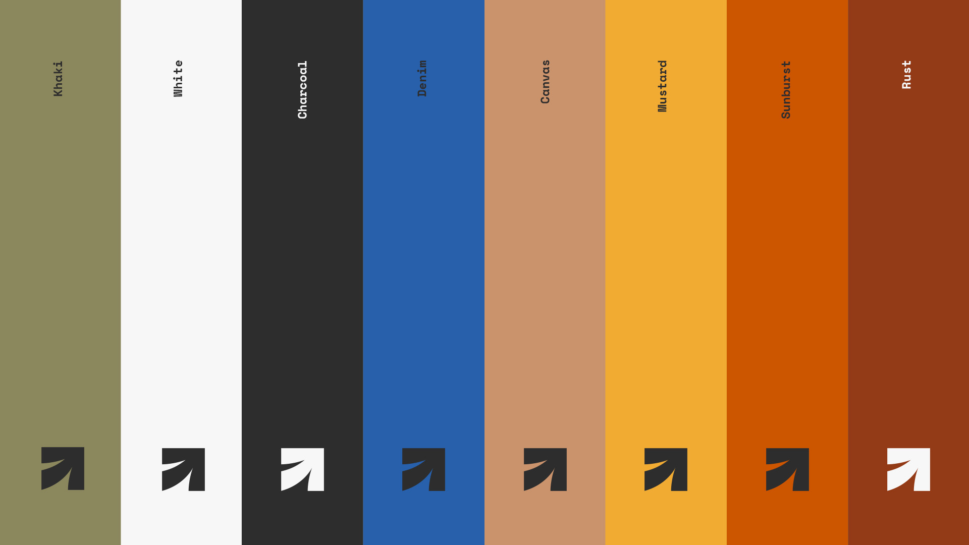
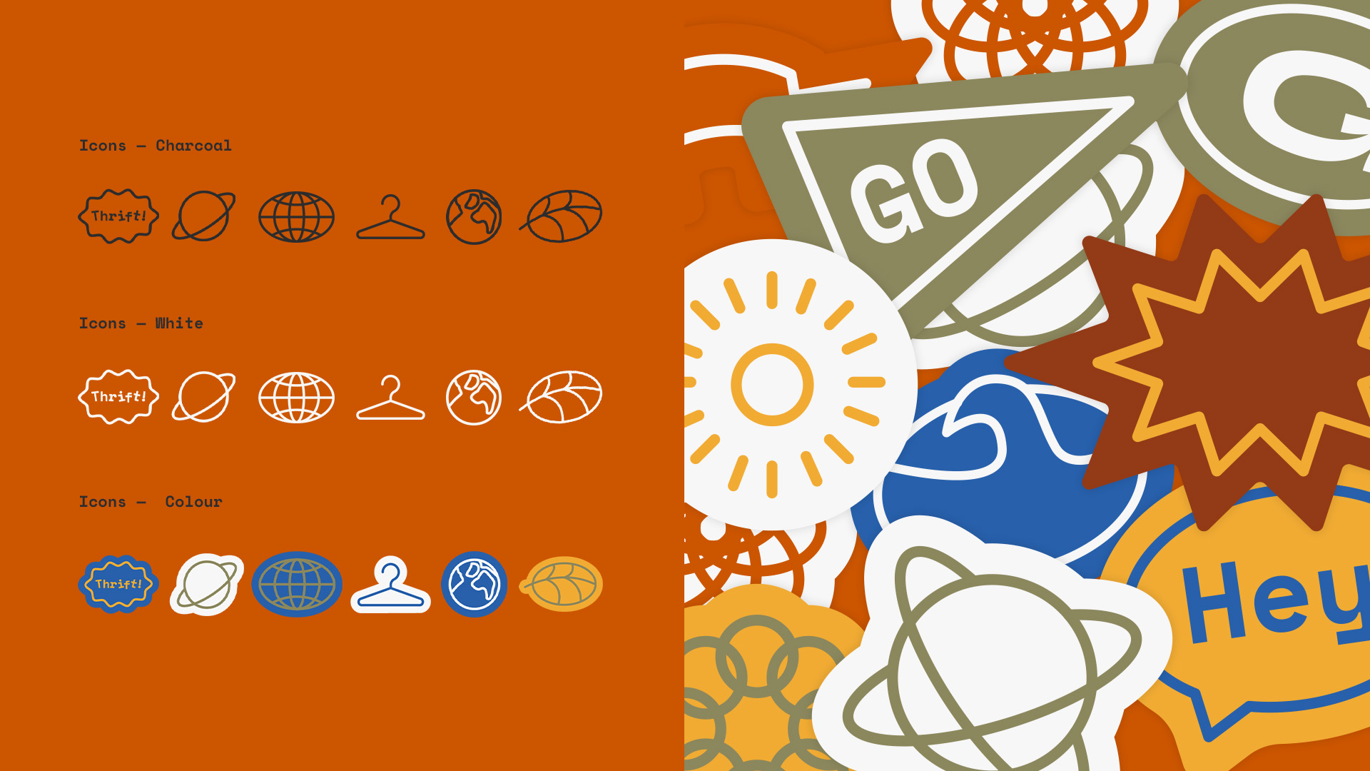
The colour palette, type direction, and sticker assets were created to mimic a 90’s-style “jumble-sale” aesthetic, which can be mixed and matched to produce a brand that can constantly reinvent itself whilst staying consistent the whole time. Additionally, as Go Thrift sells curated products from recognisable brands in the fashion space, we made sure to showcase the vintage range of stock on offer.
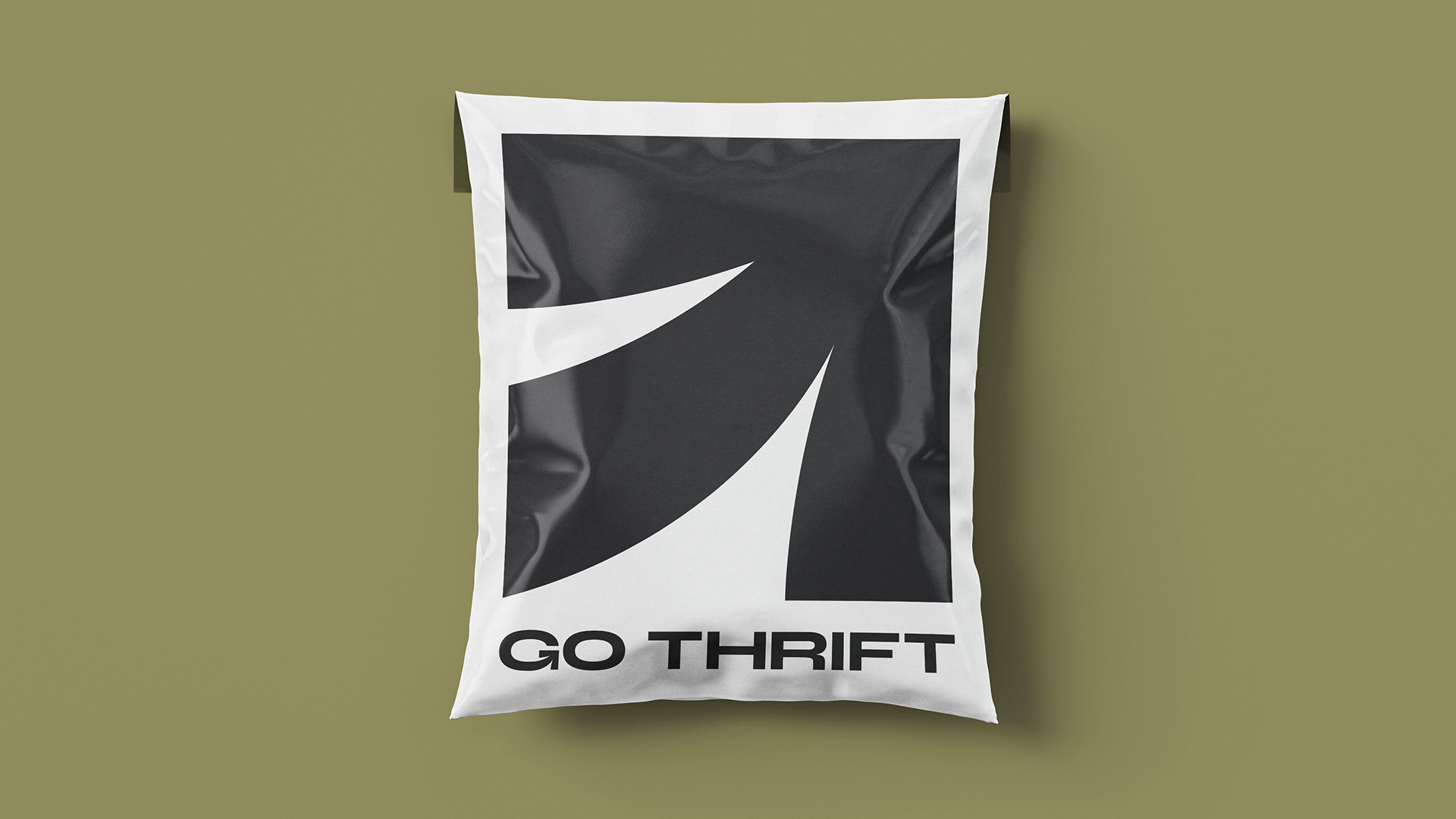
We then worked on creating a series of core assets to best represent the Go Thrift brand - fun, playful, and sustainable. The logo uses a mix of bold and modern typography with a playful symbol that represents the themes of upcycling and thrifting. The colour palette is inspired by the retro colours of vintage clothing, prioritising fun and sustainability.
One of Go Thrift’s core missions is to educate customers about the importance of buying sustainably and how buying second-hand is better for the environment. Therefore, the tone of voice we developed for Go Thrift is designed to be friendly and approachable but, primarily, informative.


Go Thrift's D2C brand launch was a success, thanks to our efforts. The brand now has a visual identity that resonates with its customers, and the messaging is aligned with its values. The brand's playful and sustainable approach has helped it stand out in a crowded market, and it continues to grow its customer base while making a positive impact on the planet.
If you’re looking to build a visual identity for your brand but don’t know where to start, contact us - we’d love to help you.
* Since the completion of this project, Go Thrift has rebranded to Loopi, a second hand resale platform.
Every great relationship starts with a conversation, so schedule your call with us now and let’s find out how we can help you unleash your potential.

The Slice is our monthly newsletter, delivered straight to your inbox on a monthly basis. Receive the latest in ecommerce news, discover our latest work, insights to help you grow your business, and more.